Edicek branding
A living manual — what Edicek stands for, how it looks, how it sounds. Founder note, core positioning, colors, typography, painted backgrounds, logos, and the UI components we build with.

A personal note

Why Edicek feels personal, where the name comes from, and why the painted backgrounds matter more than the logo.

Edicek is personal — not as a marketing claim, but literally. The name is a nickname: “Edíček” is what we call my son Eduard at home. That's where this brand starts.
Why personal? Because Edicek is you. It's the things you choose to save. The moments you decide matter. It's your own personality reflected back at you over time.
That's why the paper cut-out illustrations and backgrounds speak one warm, hand-made language. They're not decoration. They're trying to hold an emotion — something the product itself does every day: pick up your instincts, your small feelings, the why behind a save, and keep working with them.
Think of looking up at the sky. You don't care how sharp the photograph is. You care how it felt to stand there and look up. A vacation photo never quite captures the feeling of being there — it captures the place, not the moment. That's what the paintings are for: the moment, the feeling, the thing worth remembering. The detail doesn't matter. The feeling is everything.
That's THE missing detail — the one every other app forgets to ask about.
— Petr Homoky, founder of Edicek

The inbox of why

Not another bookmark manager. An inbox for the context you'd otherwise forget a week later.

A friend sends you a link to a restaurant for your anniversary. You save the bookmark to Edicek. You write one sentence why: “Would be perfect for our anniversary dinner — romantic and close to Old Town.”
Six months later, planning the evening, you can't remember the name. You search “anniversary dinner”. Edicek brings it back. Not because you typed the restaurant's name — because you once told it why it mattered, and that reason still does.
That's the whole idea. Edicek isn't a bookmark manager or a notes app or yet another database. It's an inbox for the why behind what you save. The intents. The reasons. The context you'd otherwise forget a week later.
The detail doesn't matter. The feeling is everything.
That's THE missing detail — the one every other app forgets to ask about.
Brand manual

What is Edicek

Edicek is built on knowledge that comes back to you. You invest ten seconds upfront to save hours later, transforming scattered content from digital graveyards into active assets that fuel your creative work.

We collect why, others collect what
When you save something to Edicek, you add one sentence explaining why. That context travels with the save. Same article saved for different reasons needs different treatment.
Simplicity by default, power by choice
The interface feels like Apple Notes — familiar, instant, no learning curve. Advanced features (tags, collections, AI enhancements) are off by default. You turn on only what you use.
Active knowledge, zero effort
Historical knowledge comes back to you automatically. MCP into Claude Desktop, ChatGPT extension, AI chat surfaces relevant past saves without searching. Your knowledge base gets more valuable over time, not more cluttered.
Where the look comes from

Inspiration — Henri Matisse

The paper cut-out language isn't a style pick — it's borrowed straight from Matisse's late gouaches découpées. Feeling over detail, torn paper over polish.

Painting with scissors
In his final years, too frail to stand at an easel, Henri Matisse cut shapes straight out of hand-painted paper and pinned them into whole compositions — his gouaches découpées. No outline, no shading, no fuss: a torn edge and one flat warm colour were enough to hold an entire feeling. That is exactly the bet Edicek makes — the detail doesn’t matter, the feeling is everything. A save isn’t a perfect record; it’s the shape of why something mattered.
How it shows up
Every painted background, illustrated icon and card is built the Matisse way: stacked torn-paper pieces, flat matte colour, a soft inner shadow, and no outline. The warm muted palette — linen, terracotta, lichen green — is a découpage palette, not generic SaaS. Each scene is a feeling, not a place. When something looks hand-cut instead of rendered, that is the point: it should feel made by a person, for a person.
Work in progress

Mascot

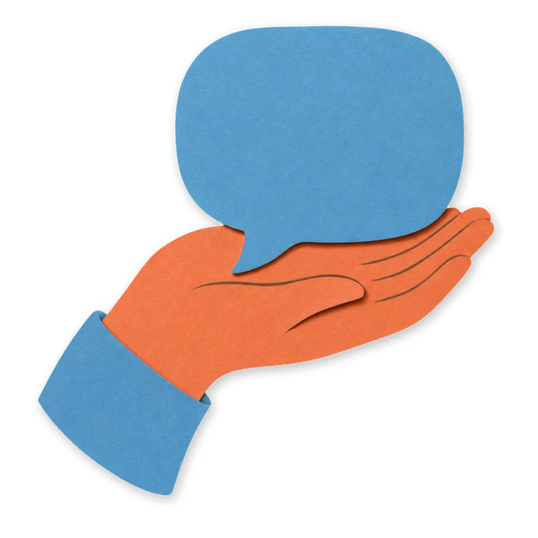
An exploration, not adopted yet. A paper cut-out character — a friendly speech-bubble — that could carry blog and changelog heroes. Parked as a brand-level decision.
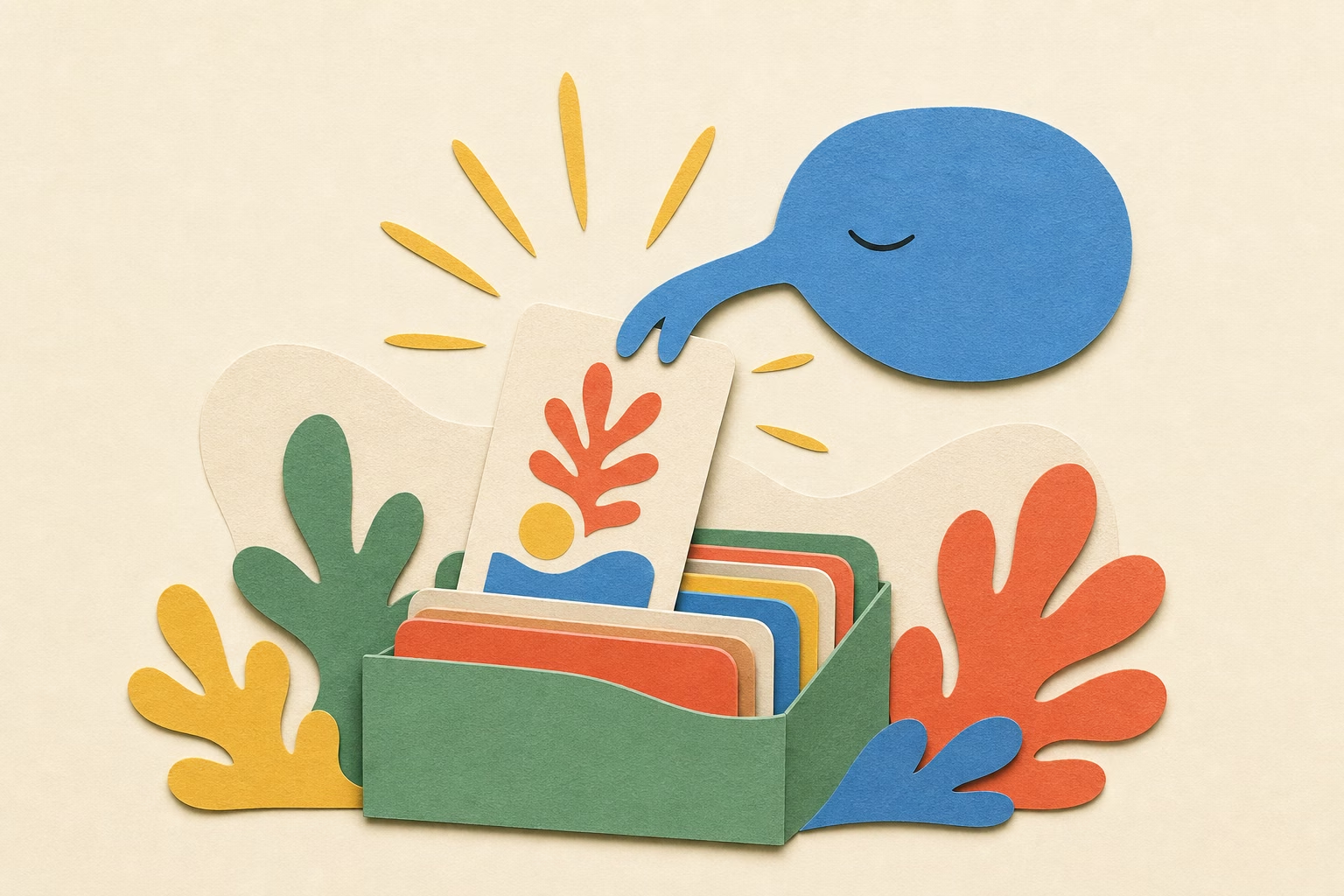
Edicek mascot exploration
What makes it work: a character + a small moment + overlapping paper layers + a focal glow — not just an object on cream.

Color palette

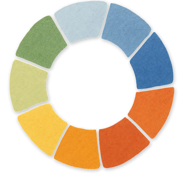
Warm muted tones. Linen is the base. Blue, green, yellow and orange are the accents. Everything softer than generic SaaS — in progress, expect subtle changes.

Tier 1
Primary palette
The everyday brand. Linen is the base, blue/orange/yellow/green are the accents, gray carries the UI structure. Reach for these first.
Base — warm neutral
Linen
The backbone of the brand. Background fills, nested frame paddings, borders. Every surface not otherwise assigned is linen.
25
oklch(0.998 0.001 85 / 1)
50
oklch(0.995 0.002 85 / 1)
100
oklch(0.985 0.005 85 / 1)
200
oklch(0.97 0.008 85 / 1)
300
oklch(0.95 0.012 85 / 1)
400
oklch(0.90 0.02 85 / 1)
500
oklch(0.76 0.04 85 / 1)
600
oklch(0.64 0.05 85 / 1)
700
oklch(0.52 0.05 85 / 1)
800
oklch(0.40 0.04 85 / 1)
900
oklch(0.28 0.03 80 / 1)
950
oklch(0.20 0.025 80 / 1)
Primary — identity
Blue
The Edicek color. Logo dots above “E” and “i”, hero numbers, brand recognition. If something has to be one accent color, it is blue.
25
oklch(0.995 0.004 235 / 1)
50
oklch(0.98 0.01 235 / 1)
100
oklch(0.95 0.03 235 / 1)
200
oklch(0.88 0.06 235 / 1)
300
oklch(0.78 0.09 235 / 1)
400
#579ece
500
oklch(0.58 0.13 235 / 1)
600
oklch(0.48 0.13 235 / 1)
700
oklch(0.38 0.11 235 / 1)
800
oklch(0.28 0.08 235 / 1)
900
oklch(0.18 0.05 235 / 1)
950
oklch(0.12 0.03 235 / 1)
Secondary — warmth
Orange
The warm companion to blue. Wavy underlines, CTA arrow strokes, emphasis that needs heat. Terracotta rust, not neon.
25
oklch(0.995 0.005 35 / 1)
50
oklch(0.97 0.02 35 / 1)
100
oklch(0.93 0.05 35 / 1)
200
oklch(0.86 0.09 35 / 1)
300
oklch(0.78 0.13 35 / 1)
400
#e3765a
500
oklch(0.57 0.16 30 / 1)
600
oklch(0.47 0.15 28 / 1)
700
oklch(0.37 0.12 25 / 1)
800
oklch(0.27 0.08 22 / 1)
900
oklch(0.18 0.05 20 / 1)
950
oklch(0.12 0.03 20 / 1)
Accent — spotlight
Yellow
The soloist. Highlight marker fills, label boxes around one key word. Used sparingly — max once per screen. If it stops feeling special, it is overused.
25
oklch(0.995 0.005 90 / 1)
50
oklch(0.98 0.02 90 / 1)
100
oklch(0.95 0.05 90 / 1)
200
oklch(0.91 0.09 90 / 1)
300
oklch(0.87 0.12 90 / 1)
400
#eecb57
500
oklch(0.72 0.13 85 / 1)
600
oklch(0.60 0.12 80 / 1)
700
oklch(0.48 0.10 75 / 1)
800
oklch(0.36 0.07 75 / 1)
900
oklch(0.26 0.05 75 / 1)
950
oklch(0.16 0.03 75 / 1)
Status — quiet
Green
Muted lichen green. Success states, “Do” labels, quiet affirmation. Intentionally low-saturation so it never competes with blue or orange.
25
oklch(0.995 0.005 145 / 1)
50
oklch(0.97 0.02 145 / 1)
100
oklch(0.93 0.04 145 / 1)
200
oklch(0.85 0.06 145 / 1)
300
oklch(0.74 0.07 145 / 1)
400
#5da474
500
oklch(0.52 0.08 145 / 1)
600
oklch(0.43 0.08 145 / 1)
700
oklch(0.34 0.07 145 / 1)
800
oklch(0.25 0.05 145 / 1)
900
oklch(0.16 0.03 145 / 1)
950
oklch(0.10 0.02 145 / 1)
UI — structure
Gray
Body text, secondary text, dividers, inputs, muted UI chrome. The quiet infrastructure every interface needs.
25
oklch(0.998 0.001 260 / 1)
50
oklch(0.98 0.003 260 / 1)
100
oklch(0.96 0.005 260 / 1)
200
oklch(0.92 0.007 260 / 1)
300
oklch(0.86 0.01 260 / 1)
400
oklch(0.72 0.015 260 / 1)
500
oklch(0.60 0.02 260 / 1)
600
oklch(0.50 0.02 260 / 1)
700
oklch(0.40 0.018 260 / 1)
800
oklch(0.30 0.015 260 / 1)
900
oklch(0.20 0.01 260 / 1)
950
oklch(0.14 0.005 260 / 1)
Tier 2
Secondary palette
When the primary palette doesn’t carry the role you need. Each colour has a specific job — warning, information, creative, decorative, vintage. Use sparingly so the primary palette stays dominant.
Utility — warning
Red
Errors, destructive actions, “Don’t” labels. Reserved for moments the user must notice. Not decorative.
25
oklch(0.995 0.005 20 / 1)
50
oklch(0.97 0.02 20 / 1)
100
oklch(0.93 0.05 20 / 1)
200
oklch(0.84 0.11 20 / 1)
300
oklch(0.72 0.15 20 / 1)
400
#be3a36
500
oklch(0.52 0.18 20 / 1)
600
oklch(0.44 0.17 20 / 1)
700
oklch(0.34 0.13 18 / 1)
800
oklch(0.25 0.09 18 / 1)
900
oklch(0.16 0.05 16 / 1)
950
oklch(0.10 0.03 16 / 1)
Information — fresh
Teal
Retro 70s teal sitting between green and blue. Use for info states, secondary primary actions, or moments that need cool freshness without sliding into corporate blue.
25
oklch(0.995 0.005 195 / 1)
50
oklch(0.97 0.02 195 / 1)
100
oklch(0.93 0.04 195 / 1)
200
oklch(0.86 0.06 195 / 1)
300
oklch(0.76 0.08 195 / 1)
400
#5fa8a8
500
oklch(0.55 0.09 195 / 1)
600
oklch(0.46 0.08 195 / 1)
700
oklch(0.36 0.06 195 / 1)
800
oklch(0.27 0.04 195 / 1)
900
oklch(0.18 0.025 195 / 1)
950
oklch(0.11 0.015 195 / 1)
Special — creative
Plum
Dusty lavender. The AI / creative / premium tier — chat moments, semantic search, intelligence features. Sits next to the painterly layer of the brand without ever turning neon.
25
oklch(0.995 0.005 295 / 1)
50
oklch(0.97 0.02 295 / 1)
100
oklch(0.93 0.05 295 / 1)
200
oklch(0.85 0.08 295 / 1)
300
oklch(0.74 0.11 295 / 1)
400
#8a6fa3
500
oklch(0.52 0.13 295 / 1)
600
oklch(0.43 0.12 295 / 1)
700
oklch(0.34 0.10 295 / 1)
800
oklch(0.25 0.07 295 / 1)
900
oklch(0.17 0.04 295 / 1)
950
oklch(0.10 0.025 295 / 1)
Decorative — soft
Rose
Vintage dusty rose. Soft feature highlights, emotional moments, decorative warmth. Distinct from red because it is never warning — it is a brand kiss, not an alert.
25
oklch(0.995 0.005 350 / 1)
50
oklch(0.97 0.02 350 / 1)
100
oklch(0.93 0.05 350 / 1)
200
oklch(0.86 0.07 350 / 1)
300
oklch(0.76 0.10 350 / 1)
400
#d18888
500
oklch(0.55 0.12 350 / 1)
600
oklch(0.46 0.11 350 / 1)
700
oklch(0.36 0.09 350 / 1)
800
oklch(0.26 0.06 350 / 1)
900
oklch(0.17 0.04 350 / 1)
950
oklch(0.10 0.025 350 / 1)
Earth — vintage
Sepia
Cocoa / sepia brown. Photography moments, blog post warmth, reading mood. Expansion of linen into a fully chromatic earth tone — same family, deeper voice.
25
oklch(0.995 0.005 55 / 1)
50
oklch(0.97 0.015 55 / 1)
100
oklch(0.93 0.03 55 / 1)
200
oklch(0.85 0.05 55 / 1)
300
oklch(0.74 0.07 55 / 1)
400
#8b6a4a
500
oklch(0.52 0.08 55 / 1)
600
oklch(0.43 0.07 55 / 1)
700
oklch(0.34 0.06 55 / 1)
800
oklch(0.25 0.04 55 / 1)
900
oklch(0.16 0.025 55 / 1)
950
oklch(0.10 0.015 55 / 1)

White & black

Two anchors of the palette. White stays pure — max-contrast surface. Black is cool ink — a subtle indigo undertone that grounds text against the warm painterly layer.

White — #FFFFFF
Pure white. True max-contrast anchor — used for surfaces that need to feel clean and bright.
Lorem ipsum dolor.
Black — oklch(0.2 0.01 260)
Cool ink. Slight indigo undertone — reads like ink on paper against warm linen. Editorial, crafted.
Lorem ipsum dolor.

Typography

Two families. Fraunces — the serif — works at every size: hero moments, section titles, card names, blog headings. Figtree — the sans — is for body and UI.

font-heading — Fraunces — Semibold · hero size
Lorem ipsum dolor.
Hero brand moments, page titles, onboarding milestones.
font-heading — Fraunces — Semibold · section size
Lorem ipsum dolor sit amet, consectetur.
Section titles, card names, navigation.
font-heading — Fraunces — Light
Lorem ipsum dolor sit amet, consectetur.
Quiet moments, blog post titles, editorial headings.
font-sans — Figtree
Lorem ipsum dolor sit amet, consectetur adipiscing elit. Sed do eiusmod tempor incididunt ut labore et dolore magna aliqua. Ut enim ad minim veniam, quis nostrud exercitation.
Body text, UI, defaults.

Illustrated icons

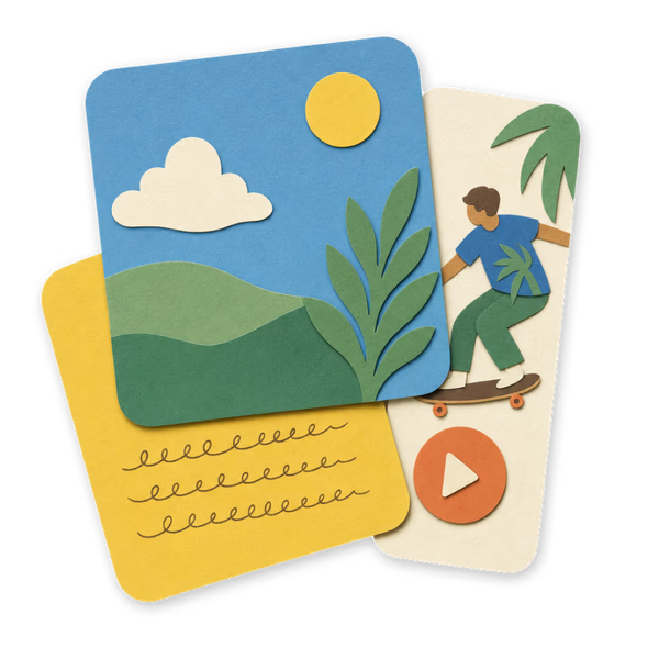
Paper cut-out collage objects — built from stacked torn-paper pieces with soft inner shadows and no outline. The same icon language across illustrations and icons.
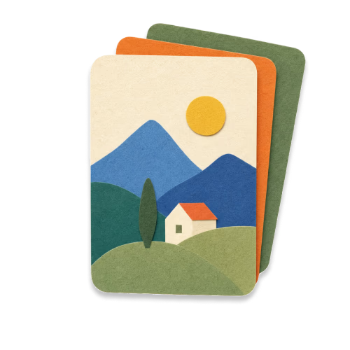
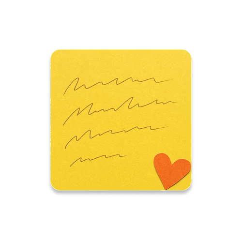
Stack of cards
Stack of cards
Note with heart
Note with heart
Search cards
Search cards
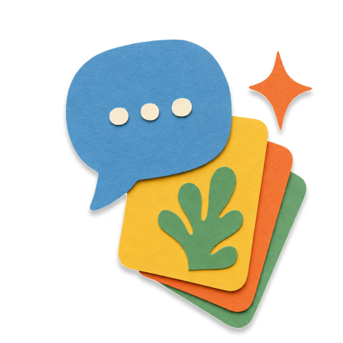
Chat about cards
Chat about cards
Star
Star
Link
Link
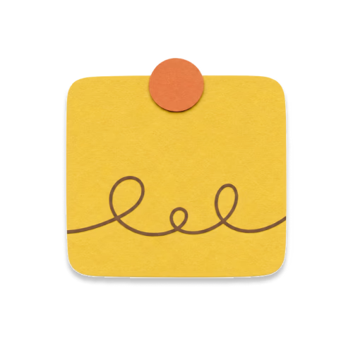
Note with dot
Note with dot
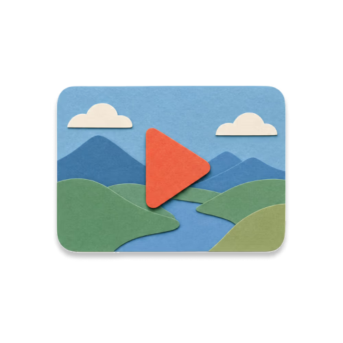
Video card
Video card
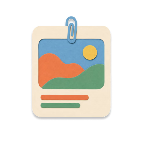
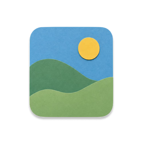
Image card
Image card
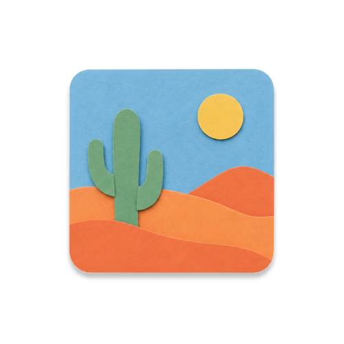
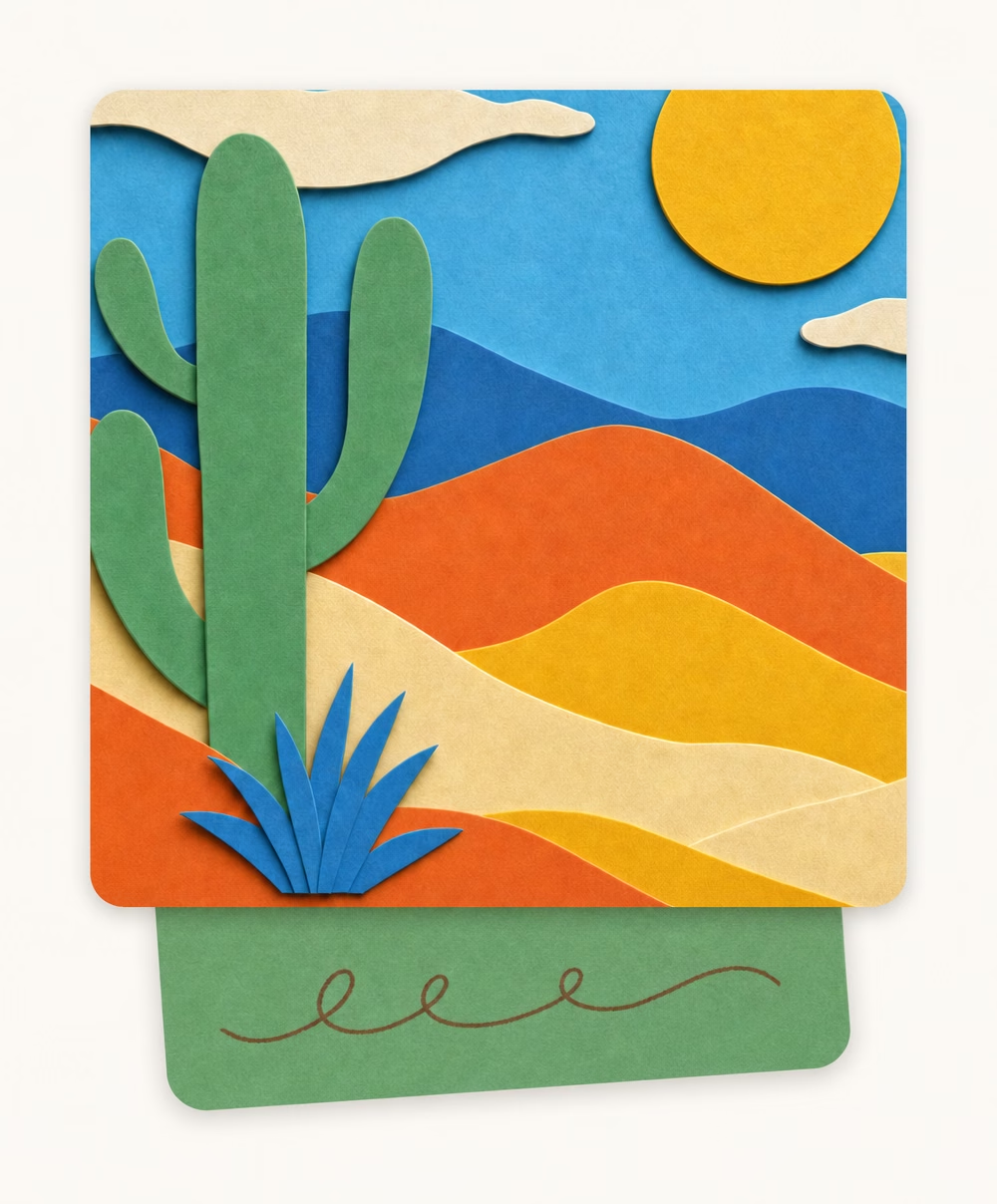
Image card (desert)
Image card (desert)
Image cards stack
Image cards stack
Idea
Idea

Paper app illustrations

Cut-out paper objects that sit above the copy on an empty screen — nothing saved yet, no search results, a fresh chat. Shared by the web app and the iOS app, so the same state looks the same everywhere.


arrow-up
error
fallback-empty-state
folder-icon-blue
hand-swipe-hint-right
loading
new-chat
no-cards
no-chats
no-collections
success-save

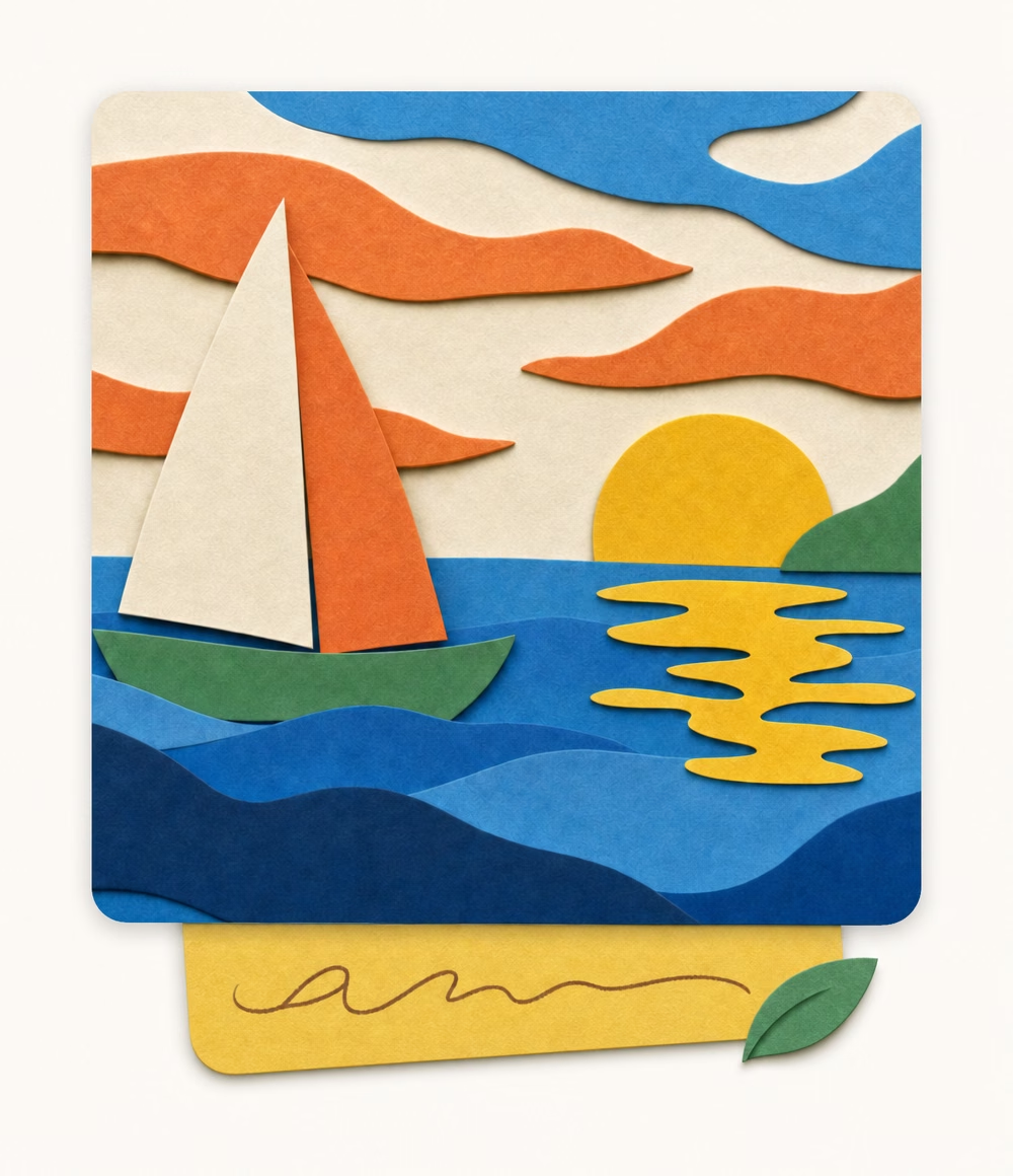
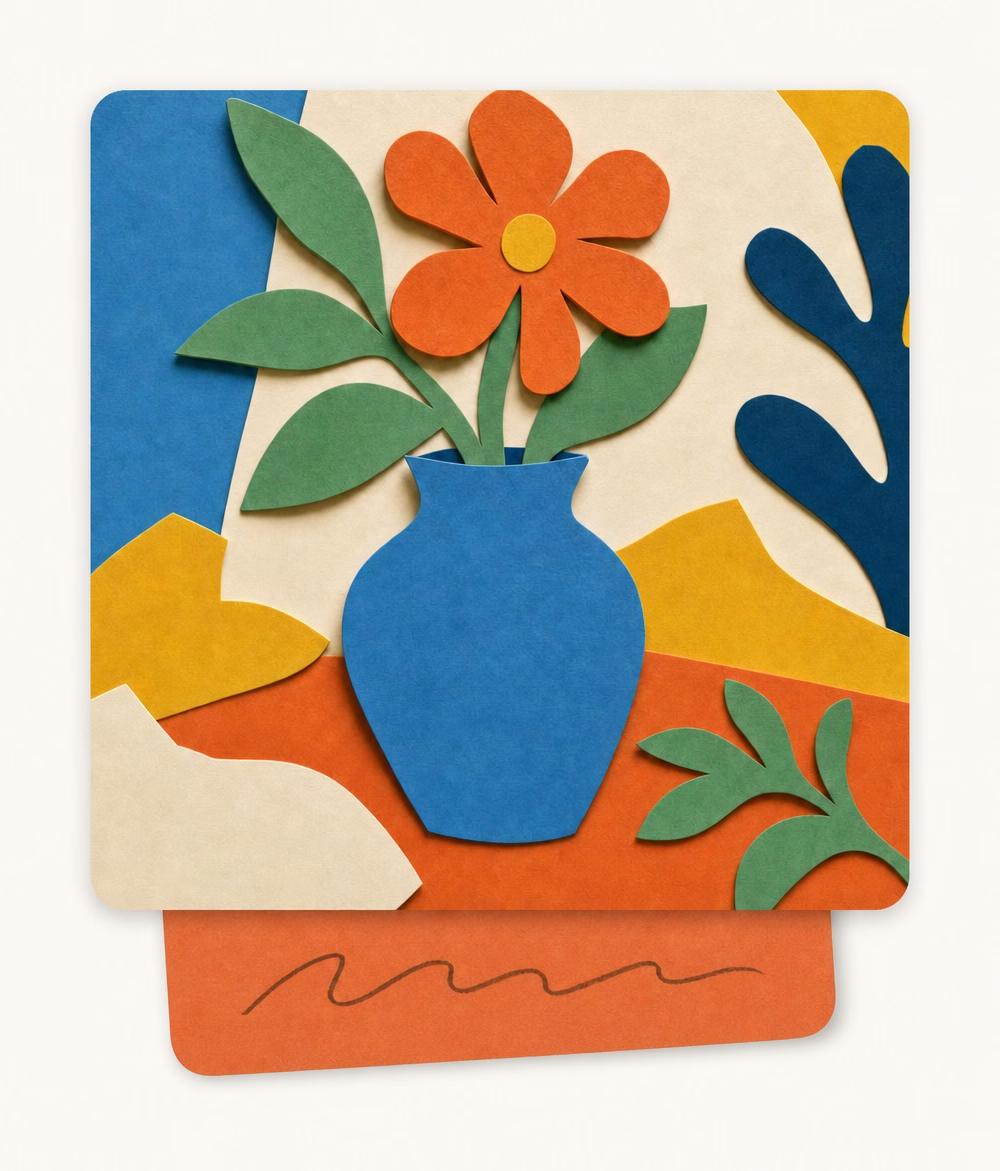
Card illustrations

A card is a saved item. The canonical card set: consumed content shown concretely (YouTube, TikTok, Image), a note card, and a card with the user's own note tucked under it. Reusable examples to build from.
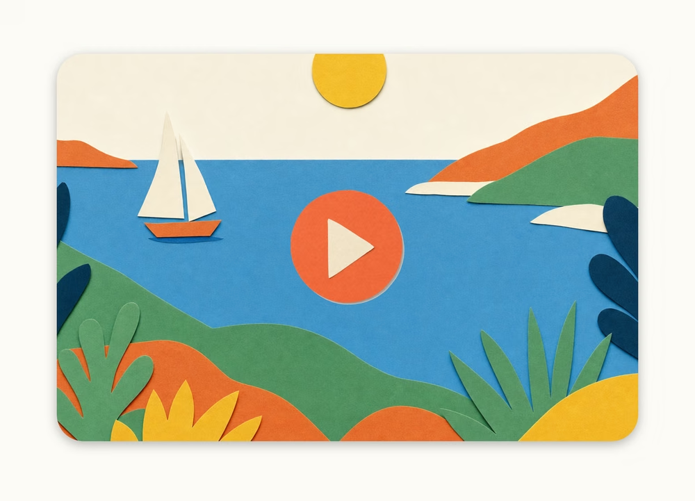
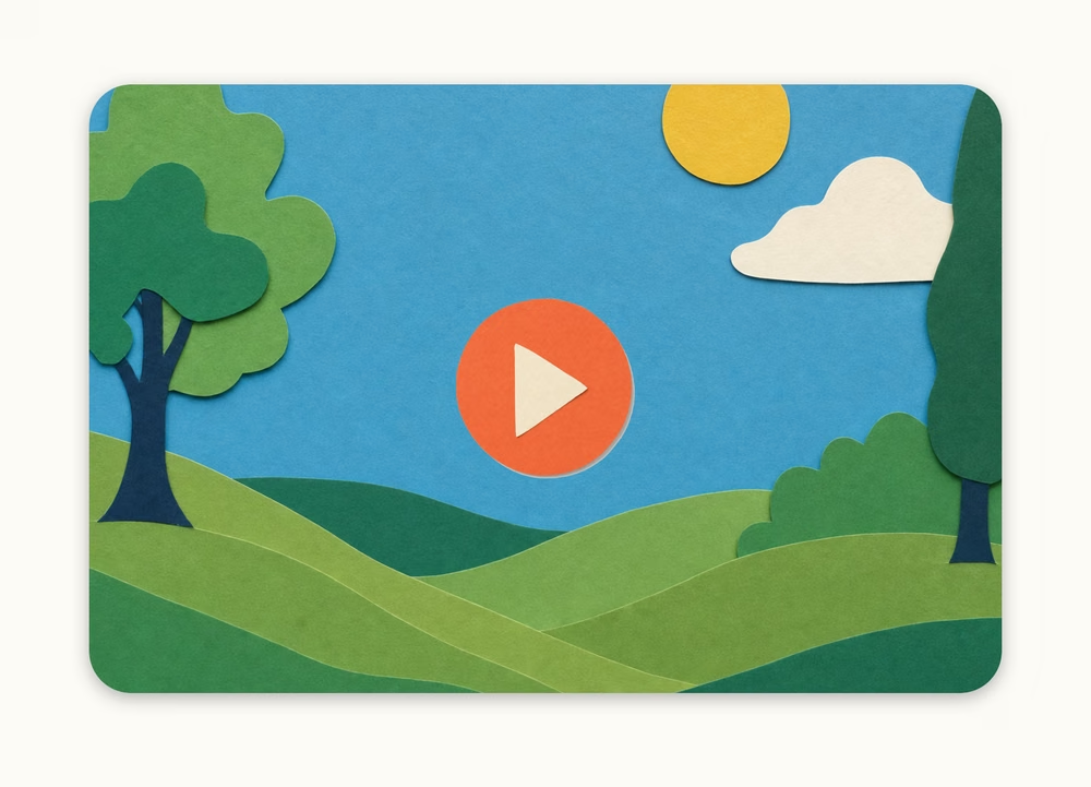
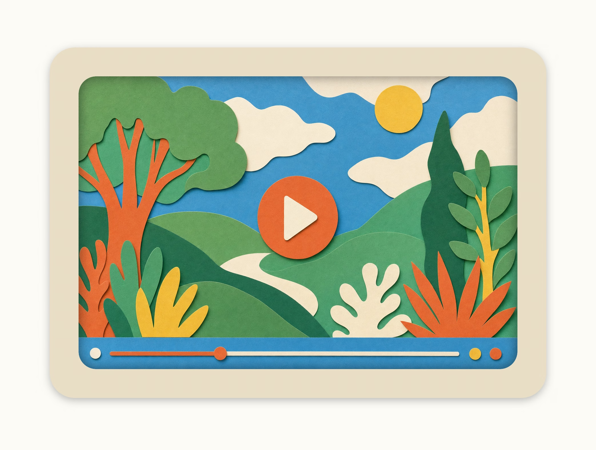
YouTube card
Landscape 16:9 video — a play button over the full-bleed scene.
youtube-1
youtube-1
youtube-2
youtube-2
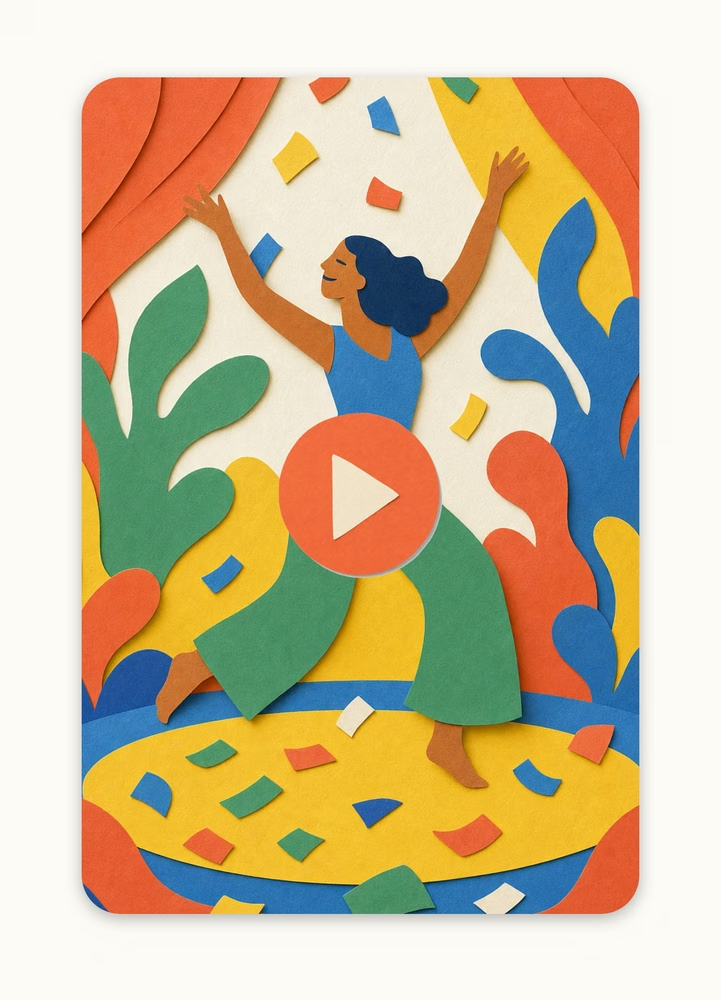
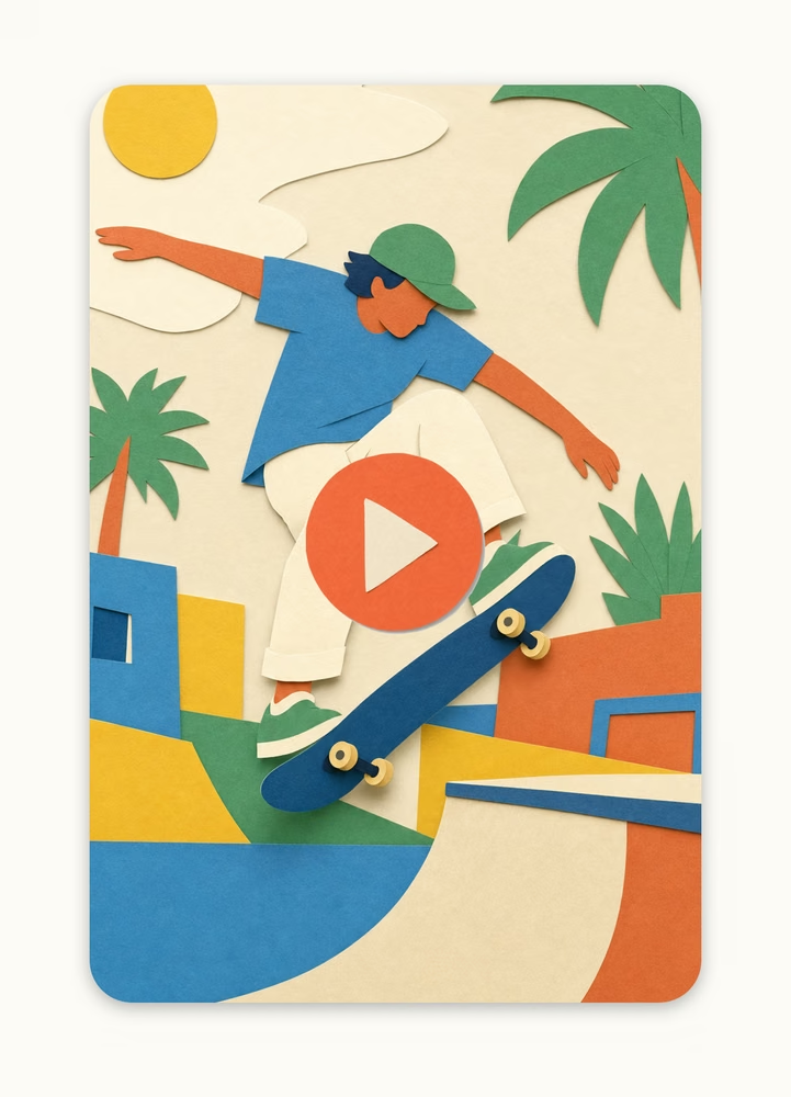
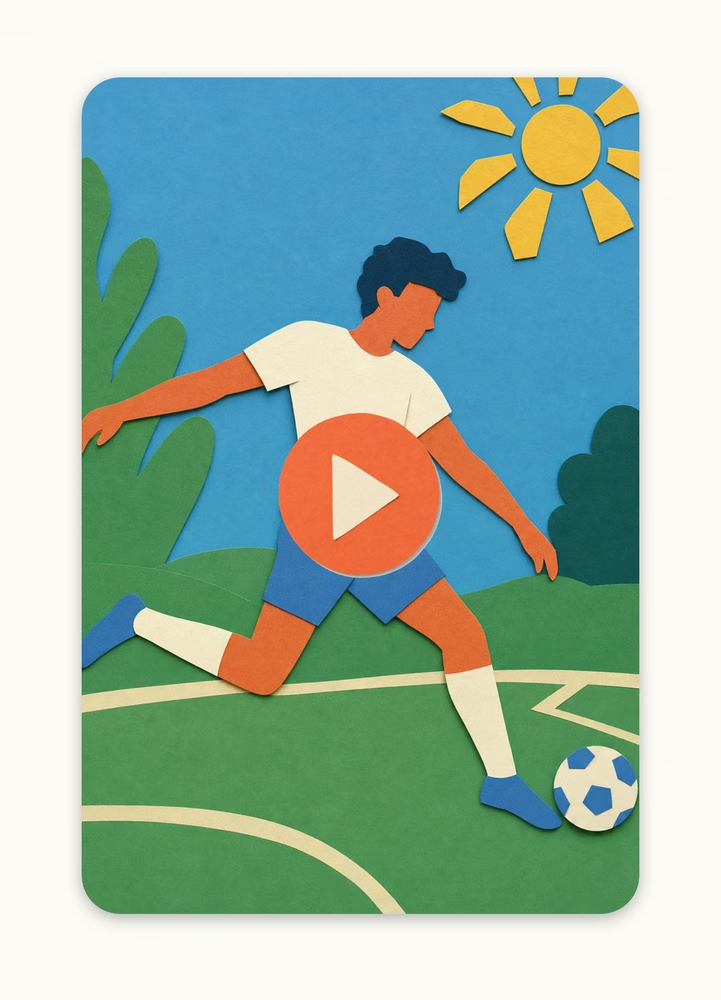
TikTok card
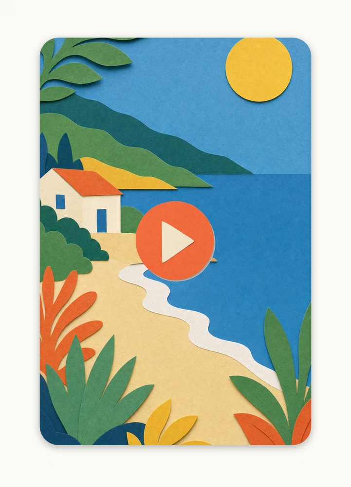
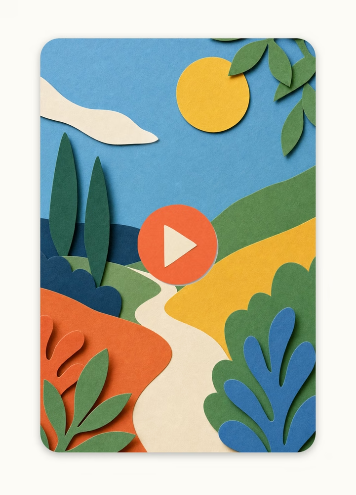
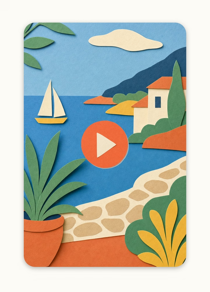
Vertical video — play button centred over the scene.
tiktok-1
tiktok-1
tiktok-2
tiktok-2
tiktok-3
tiktok-3
tiktok-4
tiktok-4
tiktok-5
tiktok-5
tiktok-6
tiktok-6
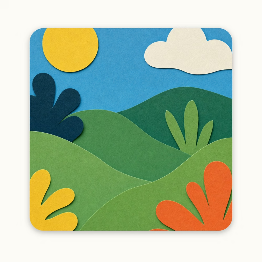
Image card
A saved image — square, no play button, no note.
image-1
image-1
image-2
image-2
image-3
image-3
image-4
image-4
image-5
image-5
image-6
image-6
image-7
image-7
image-8
image-8
image-9
image-9
image-10
image-10
Note card
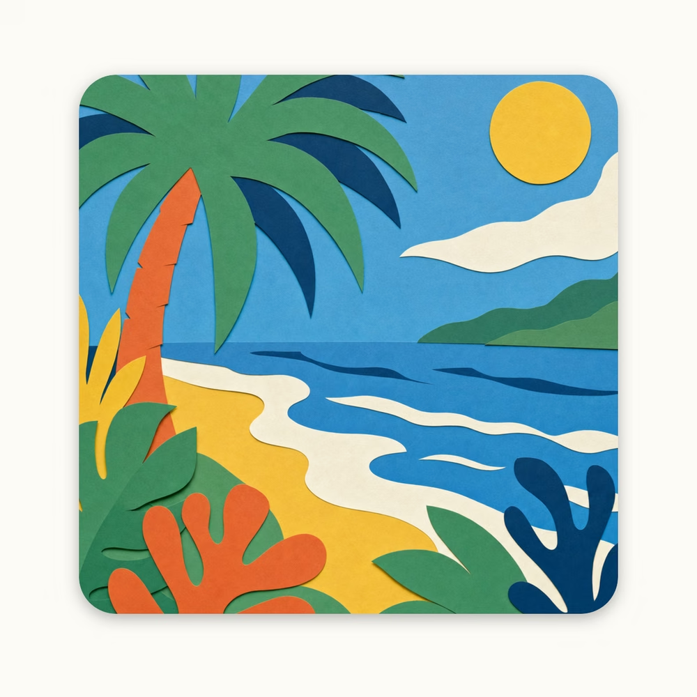
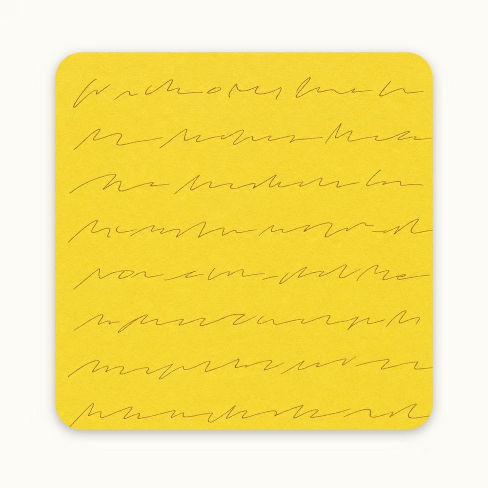
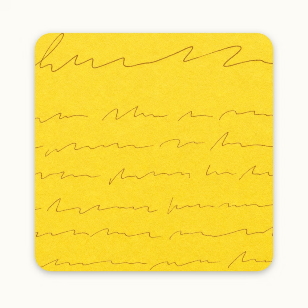
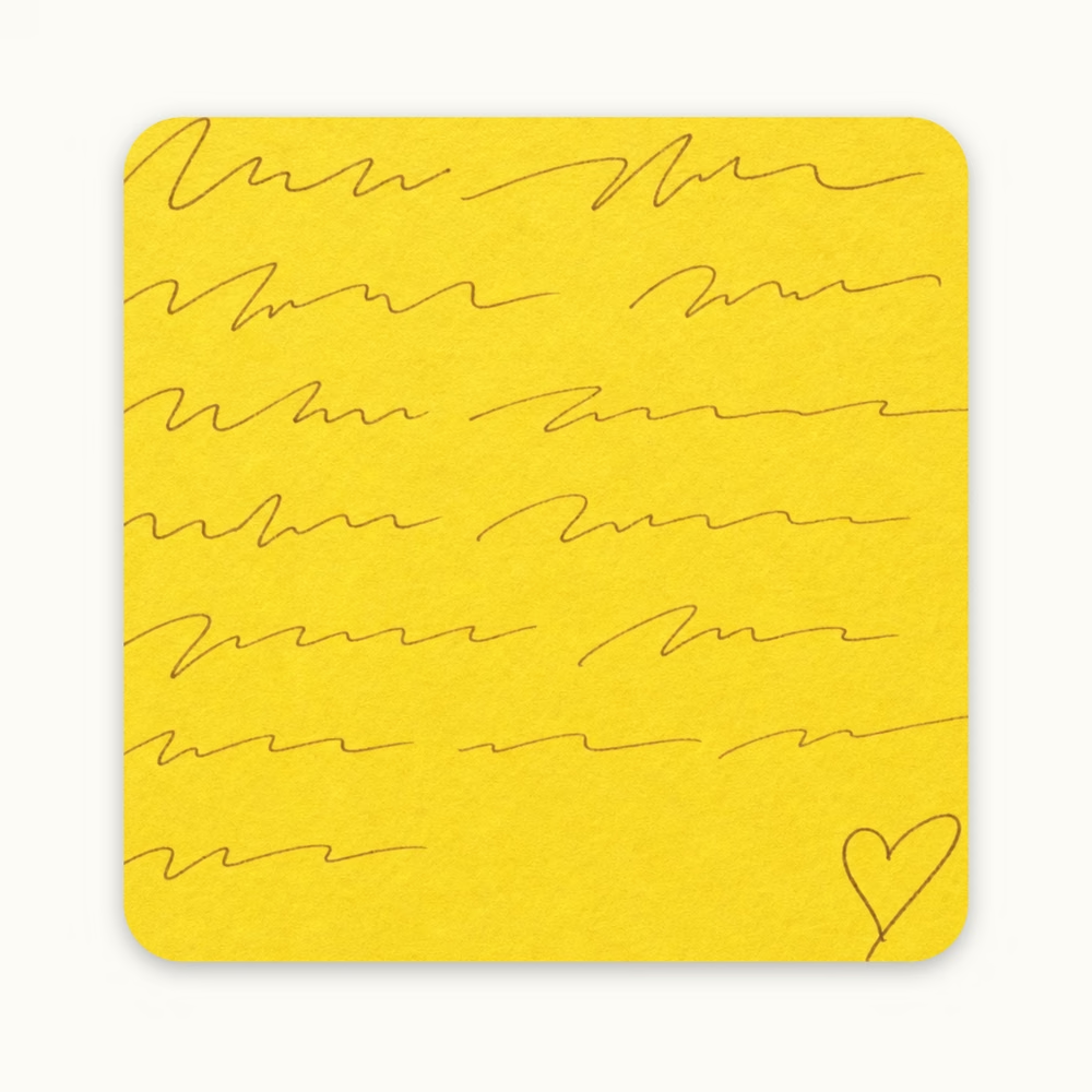
The note is the saved item — fine handwriting scribble, or empty.
note-1
note-1
note-2
note-2
note-3
note-3
note-4
note-4
note-5
note-5
note-6
note-6
note-7
note-7
note-8
note-8
note-9
note-9
note-10
note-10
note-11
note-11
note-12
note-12
note-13
note-13
Card with user note
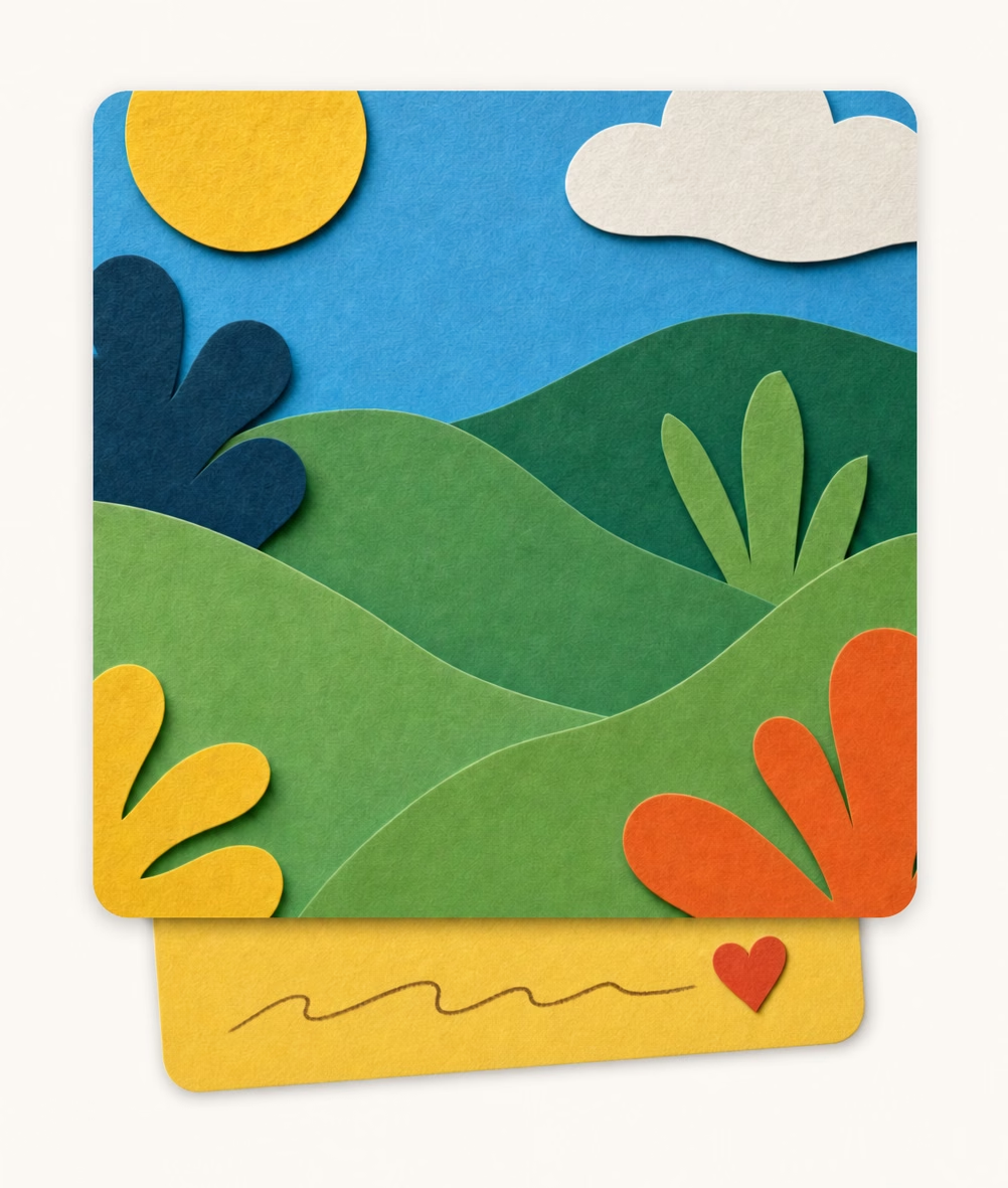
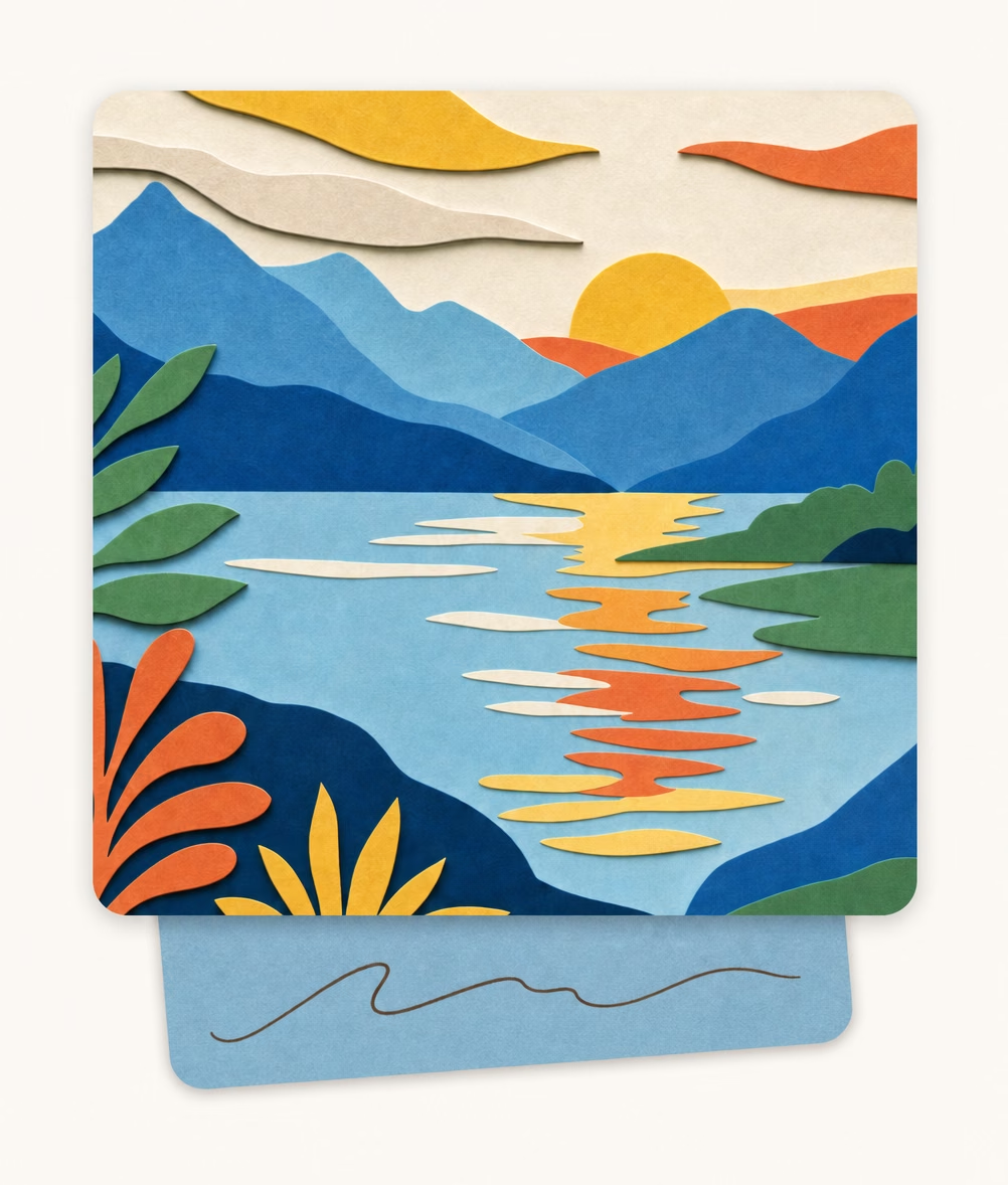
A card with the user’s own note slip (~80% width) tucked under it — tilted left-to-right, ornament (on yellow) optional.
usernote-1
usernote-1
usernote-2
usernote-2
usernote-3
usernote-3
usernote-4
usernote-4
usernote-5
usernote-5
Card rules
• The main card always has the same rounded corners and a similar upright portrait ratio — the constant shape that makes a “card” recognisable.
• Videos are the exception: a vertical clip (TikTok / Reels) or another player can use a different frame ratio.
• A user note is the user’s own note belonging to a card — one wide slip (~80% of the card’s width) with rounded corners, tucked under the card and peeking out from the bottom, carrying a fine warm-brown scribble.
• Ornaments (leaves, small flowers) may overlap the note and card corners for warmth — but never break the card’s rounded shape.
Full spec: .claude/guidelines/card-illustrations.md
Consumed content — inner-window motif
The unifying device for consumed content: a rounded inner window framed by a constant-width sand border; the window’s content alone says the type (play, browser, photo, post). The window is recessed with a soft inner shadow on all four edges.
youtube — horizontal
youtube — vertical
youtube — vertical
tiktok
tiktok
web
web
tweet
tweet

App card views

Edicek cards as the product actually draws them — the same cards you see in the web app and in the iPhone and iPad apps. They are not only product UI: the cards are made to be used in marketing materials too, the way this site and our videos use them.
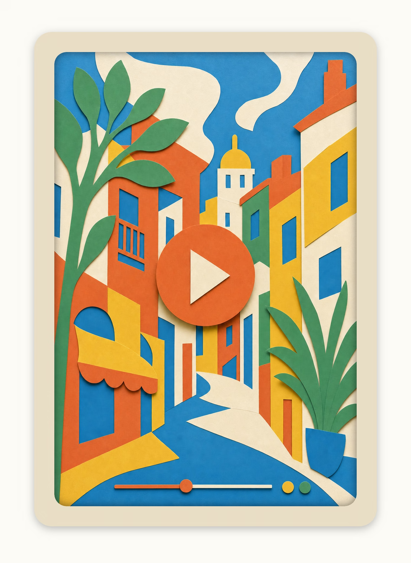
Link
Absolutely perfect animations, both for web and iOS. Can't really download them — more of an inspiration thing. But this guy does seriously great work. Found him on Twitter.
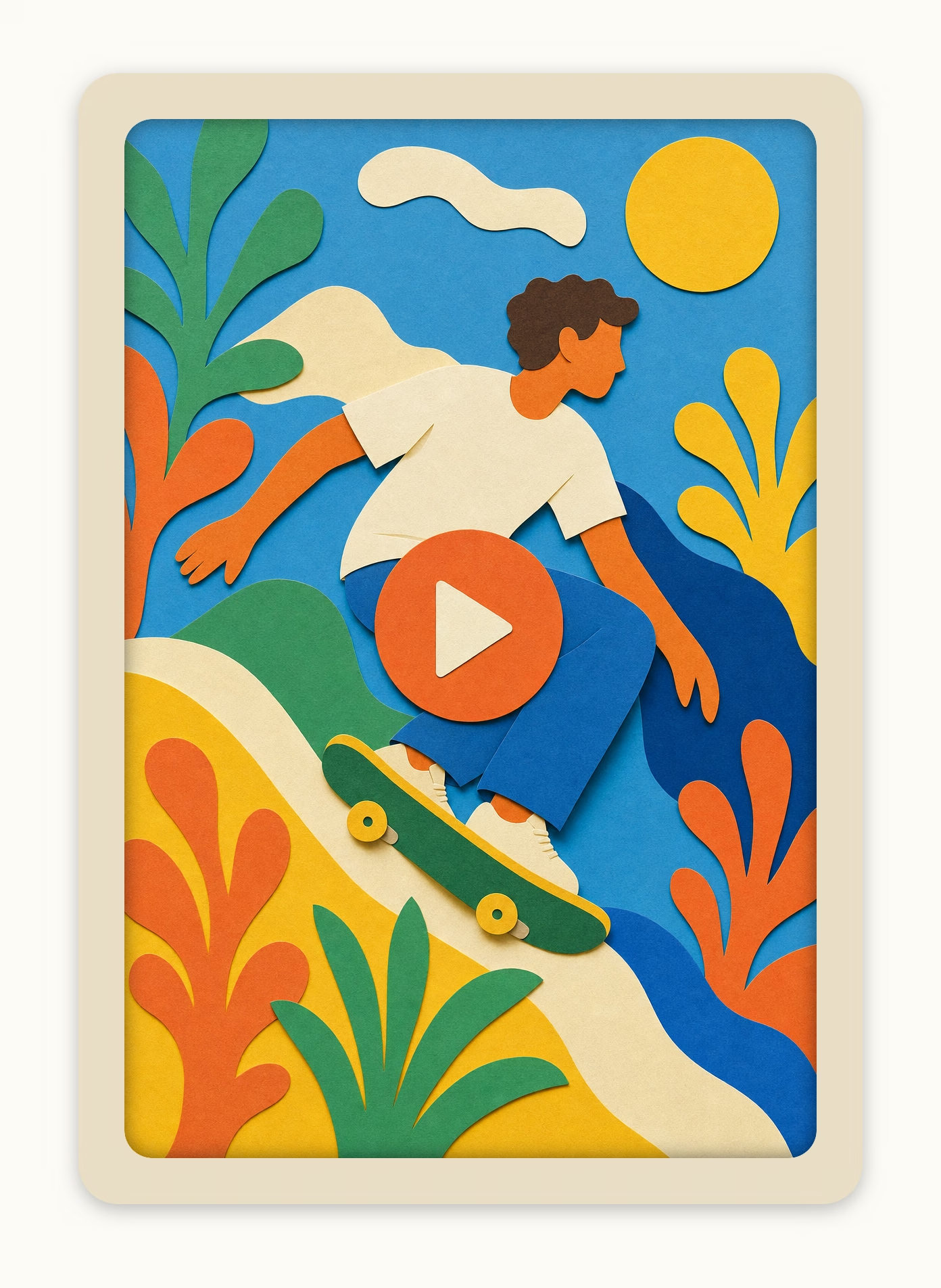
Note
“You don't need more time, you need fewer priorities.” — heard it on the podcast this morning. Been thinking about it all day. Feels true in a way I can't shake off.
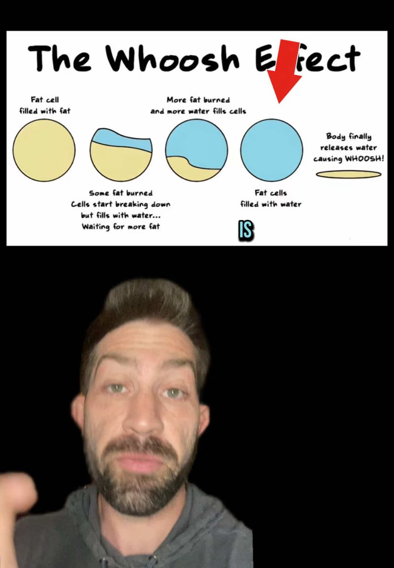
TikTok
Whoosh effect. Weight loss simply isn't linear.
Tweet
Petr Homoky
@homoky
“I should have started sooner.” Maybe. Or maybe you needed everything between then and now to be ready for it.
The reply is the part I keep coming back to — exactly what I needed to hear about timing.
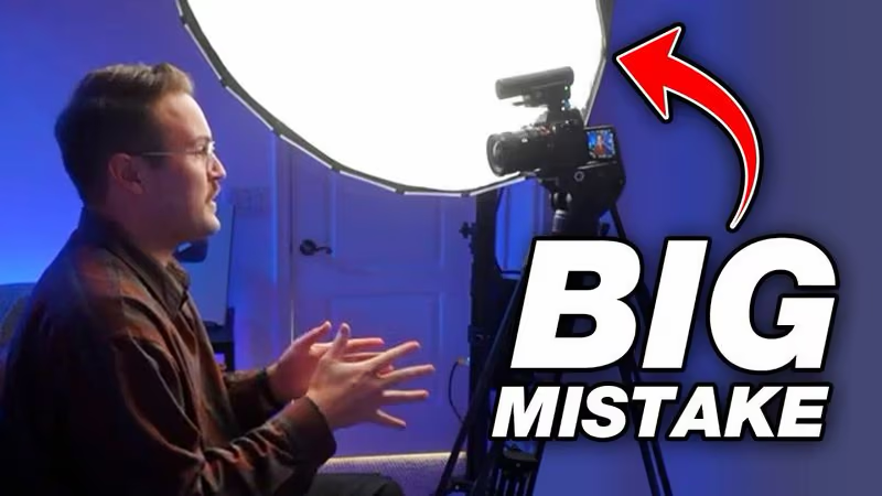
YouTube
Wow. This is exactly what happens in my videos. My light is too low — just raise it, 45° from the side, but most importantly not at eye level, top-down — and the reflections on the glasses are gone.

Linen frames

Nested rounded frames built from linen tones. Outer frame is linen-300 border, inner padding fill is linen-100 or painted background, inside sits the white content card with a linen-200 border (100 weaker than outer).

Linen frame
Default framing for cards and steps.
Linen frame — card
Linen fill with a comfortable ~10px border around the white card. Preferred over a thin double border with no background.
Painted frame — subtle
Thin painted border, white card inside. Default painted variant.
Painted frame — hero
Large p-8 padding shows generous painted border. Used for pricing hero and standout statements.

Painted backgrounds

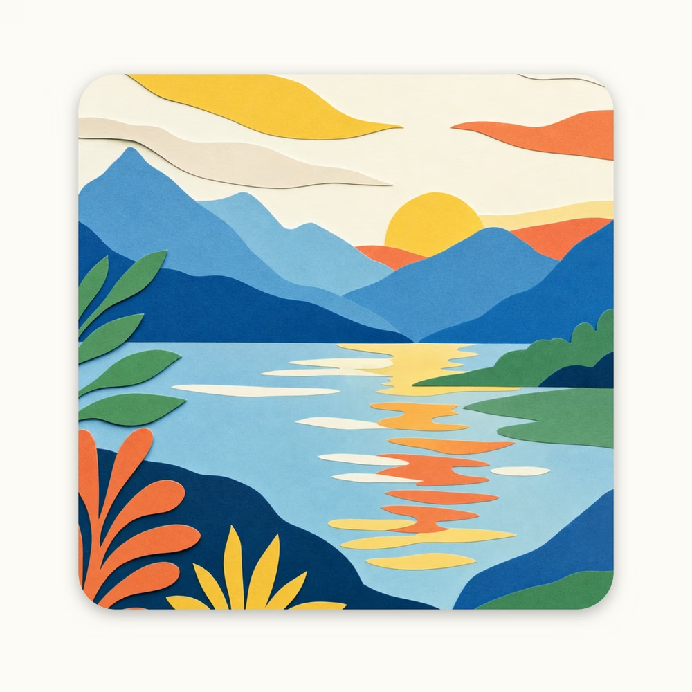
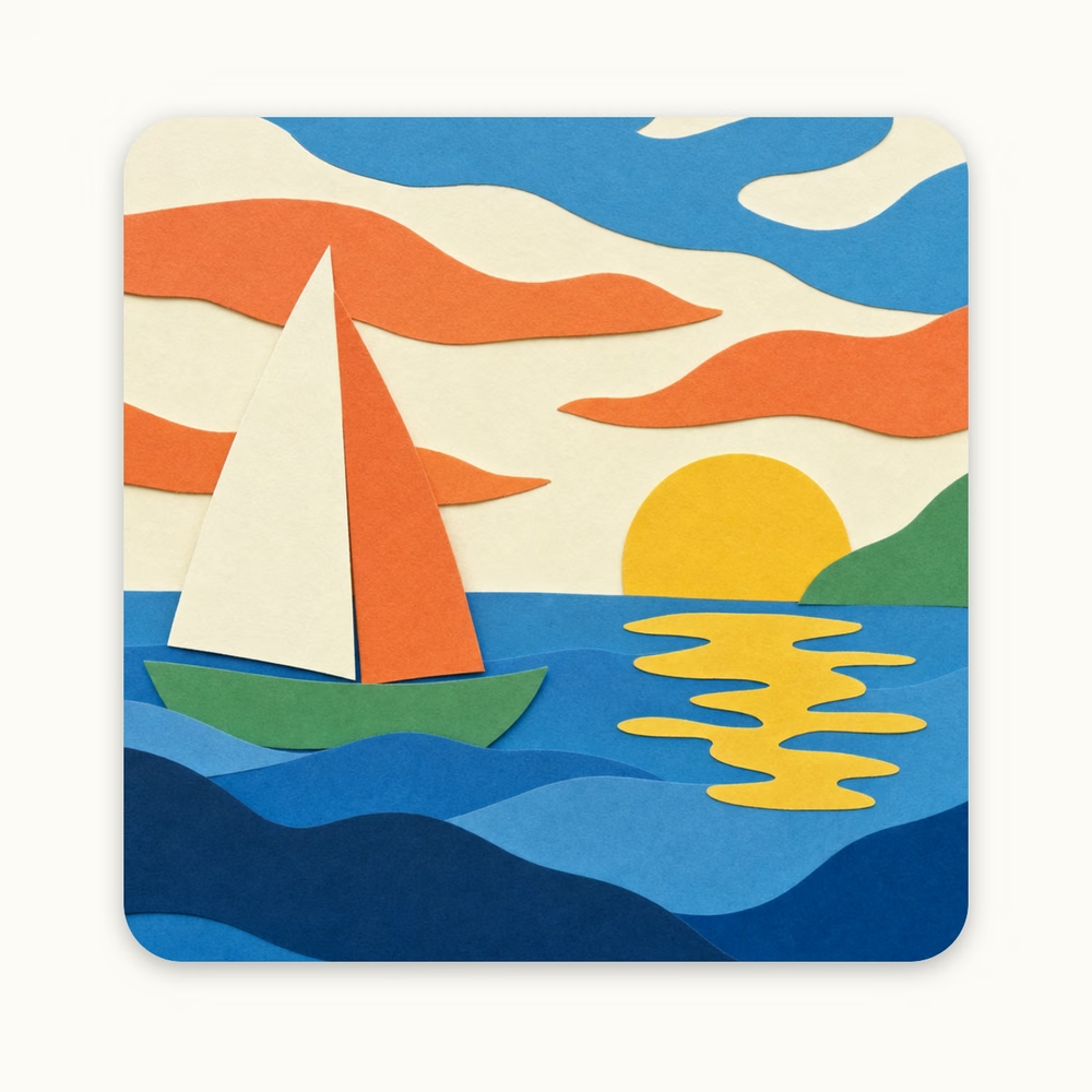
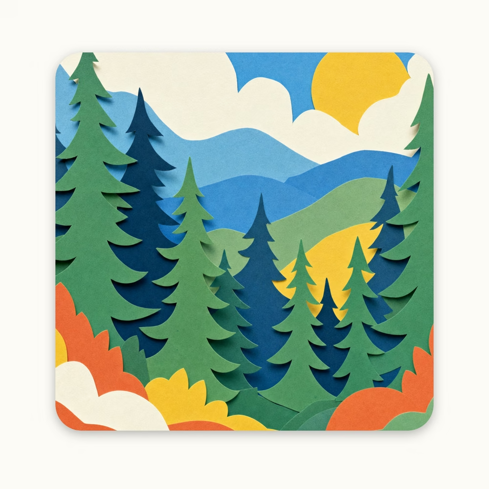
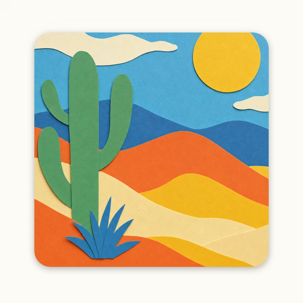
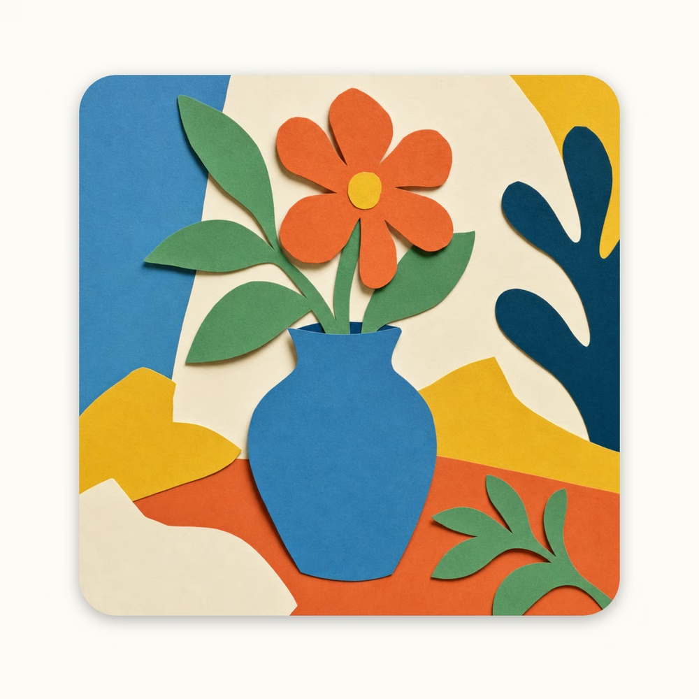
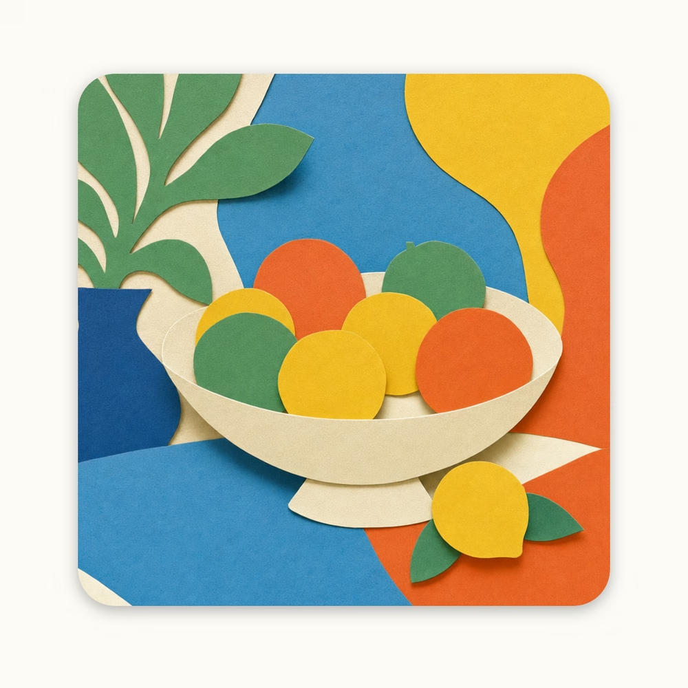
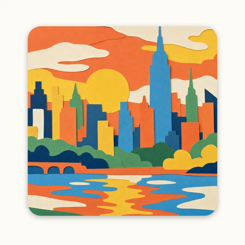
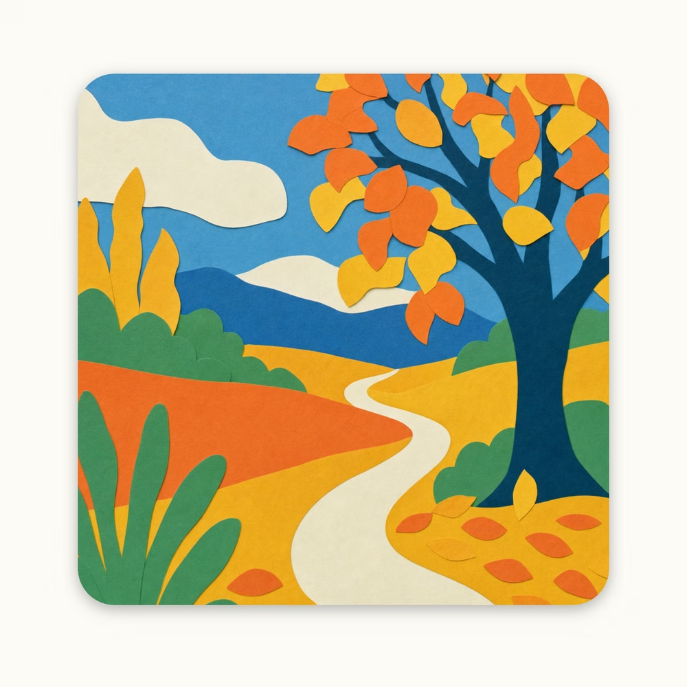
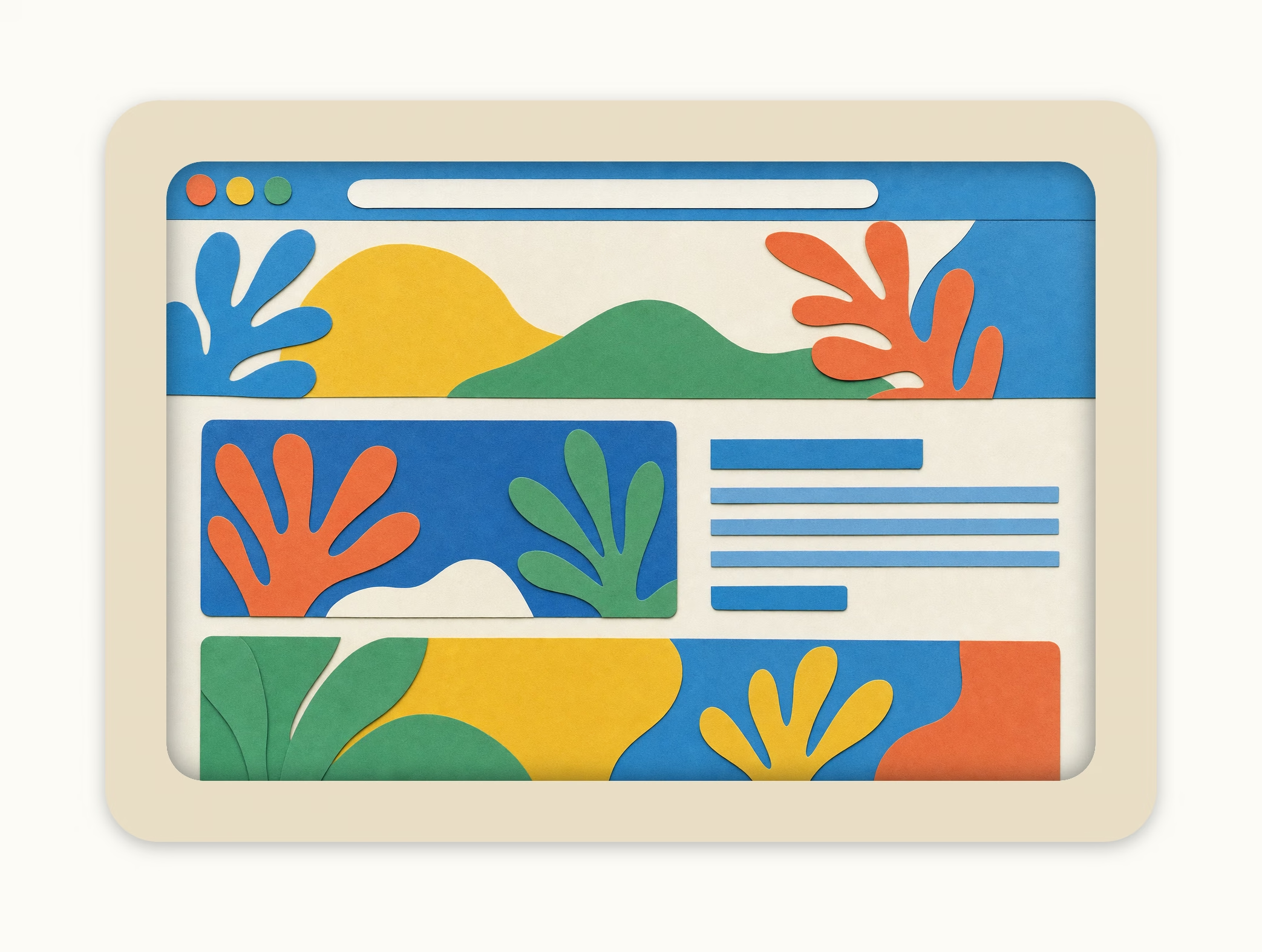
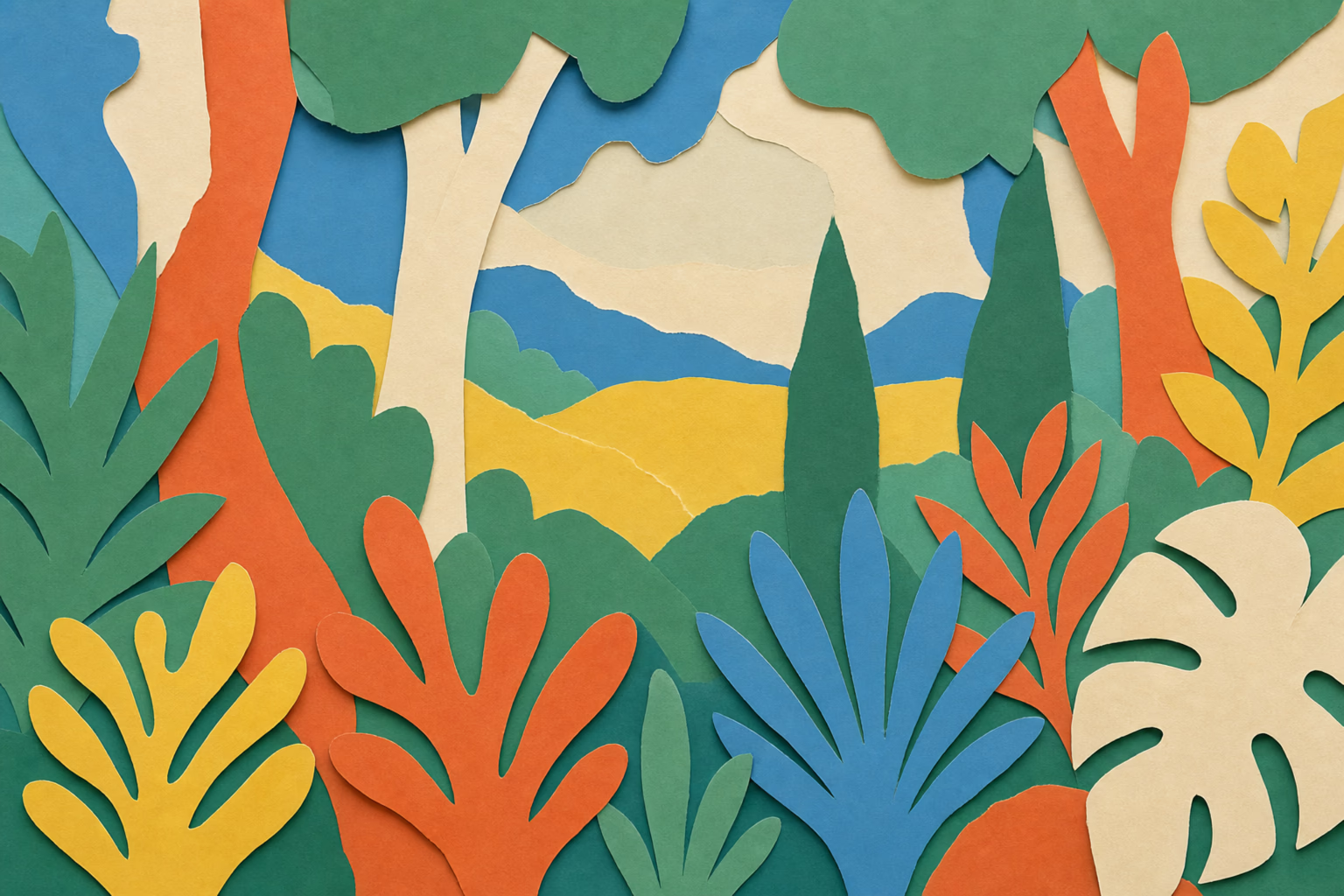
Abstract paper cut-out collage scenes used as warm, non-SaaS backgrounds. Prompt system in libs/branding/painted-backgrounds. Each scene is a feeling, not a place.
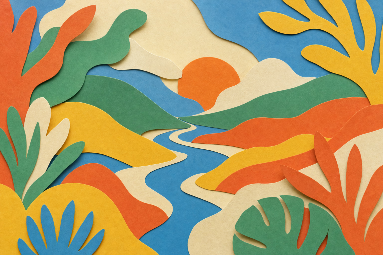
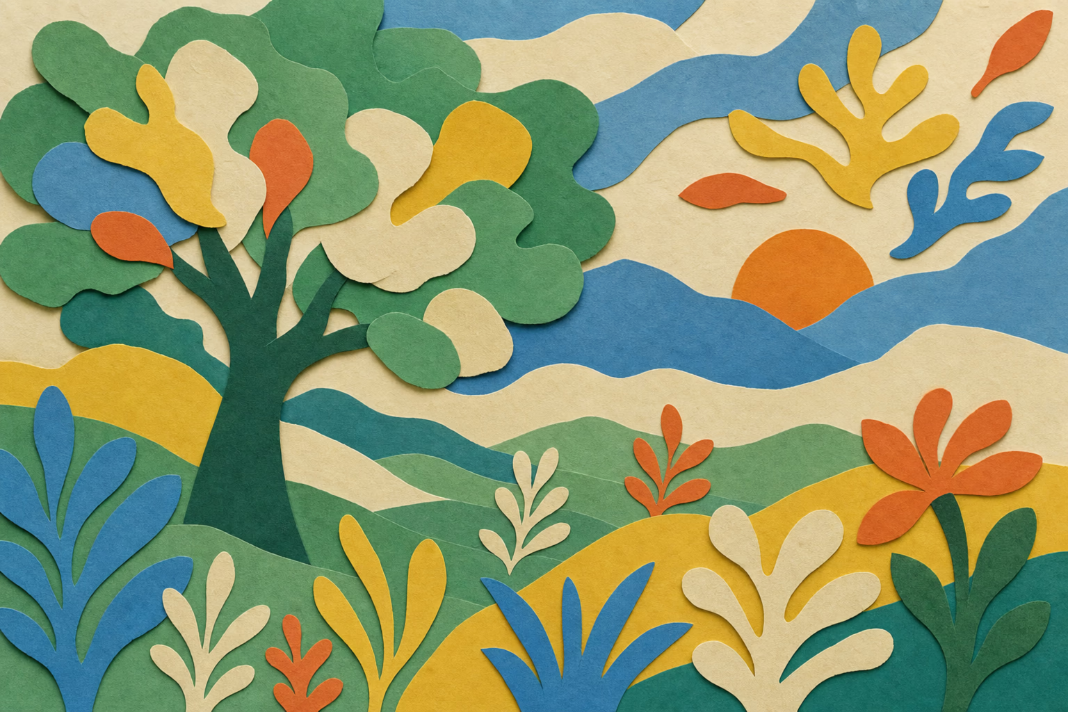
variant=1
variant=2
variant=3
variant=4
variant=5

Paper sheets

Full-frame textures of a single sheet of coloured construction paper — the material every cut-out is made of. Where a paper piece is drawn in CSS instead of cut out of a picture, one of these sheets is its background. Prompt in libs/branding/paper-sheets.

black
blue
brick-red
cream
dark-green
green
kraft-brown
orange
sand
white
yellow

Icons

Stroke icons from Hugeicons plus custom marks. Used across the app for actions, navigation and content types.

Hugeicons
Stroke icons from the Hugeicons set, used for actions and navigation.
add
alertDanger
alertInfo
alertWarning
arrowDown
arrowLeft
arrowRight
arrowRightLong
arrowUpRight
bookOpen
brokenBone
bug
cancel
circleArrowUp
coins
copy
coupon
creditCard
creditCardAdd
delete
desk
edit
filter
filterEdit
filterRemove
flag
folder
funnel
globe
hold
home
insight
inspectCode
iterationCw
knowledge
legal
link
logout
mail
menu
menuTwoLine
moreHorizontal
moveRight
panelLeft
pin
pinAlt
pinOff
refresh
save
search
settings
sortCardsDown
sortCardsUp
sorting
text
textCursor
tick
upload
user
userCircle
userGroup
userPen
view
viewOffSlash
Custom
Drawn for Edicek where no Hugeicon carries the right meaning.
alertSuccess
bookmarkAdd
cardAdd
cards
chat
chatAdd
copyLink
copyMarkdown
note
noteAdd
Card types
Solid marks that say what a card is — a link, a note, a video.
cardTypeImage
cardTypeLink
cardTypeNote
cardTypeTiktok
cardTypeTwitter
cardTypeYoutube
Logo variants
The Edicek face. Used for empty states and moments where the product speaks in its own voice.
sadFace
Hugeicon rules
• Downloaded from Hugeicons in the Stroke / Standard style — never Rounded, Sharp, Twotone or Bulk. That one choice is what keeps the set looking like a single family.
• Drawn on a 24 × 24 canvas, exported at 128 px. The viewBox stays 0 0 24 24, so every icon scales from the same grid.
• Stroke width 2, with round caps and round joins. Nothing thinner, nothing squared off.
• Open shapes: fill="none" with stroke="currentColor", so an icon takes the colour of the text around it. The few solid Hugeicons carry fill="currentColor" instead.
• Rendered at 20 px by default (size-5); any other size is set where the icon is used, never baked into the asset.
• The SVG in libs/branding/source/hugeicons/ is the only hand-edited file — it is registered in source.json under a hugeicon- name, and the React component and Xcode imageset are both generated from it.
Full spec: .claude/commands/new-hugeicons.md, .claude/commands/sync-icons.md

Button

Optional backgroundVariant prop wraps the button in a frame — 'linen' for a calm halo, 1–5 for a painted halo. Default is unframed.

size="small" · naked
size="small" · linen
size="small" · painted 2
size="base" · naked
size="base" · linen
size="base" · painted 2
size="medium" · naked
size="medium" · linen
size="medium" · painted 2
size="large" · naked
size="large" · linen
size="large" · painted 2

Pill

Neutral, outlined. Used for section/page labels — quiet wayfinding that doesn't compete with the title.

Brand manual
Pricing
Changelog
Blog

Loading

Three colored dots that bounce in sequence. Sized in em — set the font-size on the parent (or a className like text-xs / text-2xl) and the dots scale with it. By default the loader hides for the first second to avoid flashing on fast responses; pass `immediate` to show it right away.

text-base
text-lg
text-2xl
text-5xl

Thinking

A label followed by the bouncing Loading dots. Used for AI / search states where a plain spinner would feel too cold. Default label is 'Thinking' — pass any string. Inherits font-size, so the className controls both the text and the dots together.

Thinking
Searching cards