iOS 1.6 — Unified UI & Sharper Gestures

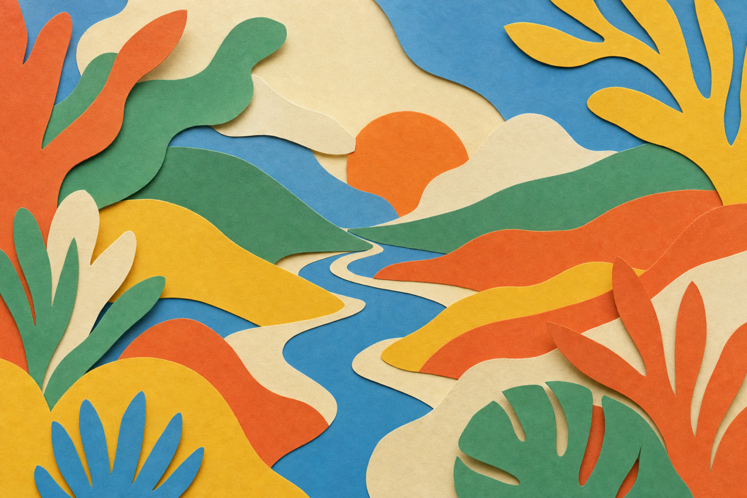
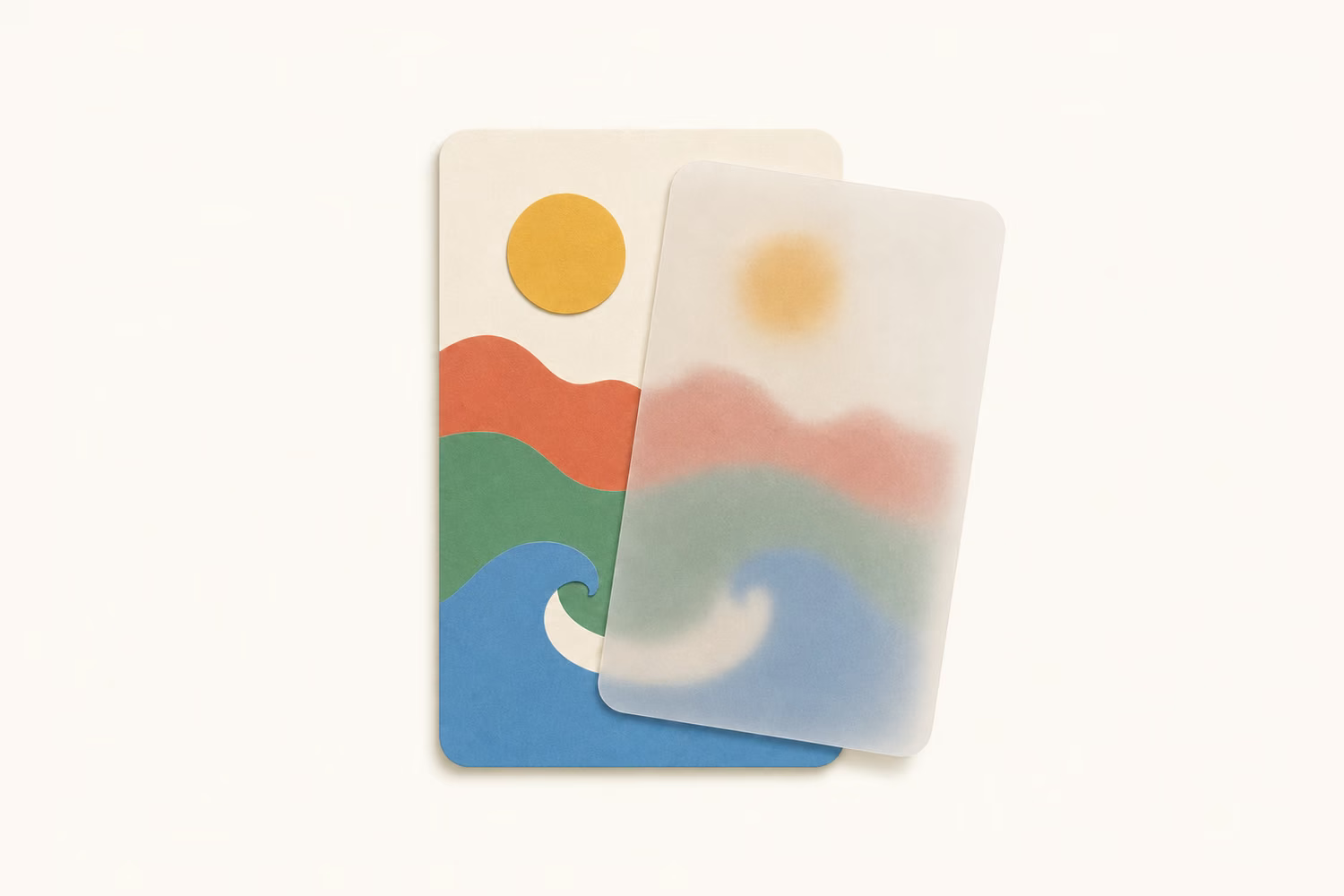
Looks like a small update on the surface, but under the hood it's a big one. The iOS app now speaks the same brand language as the web — warm linen surfaces and crisp thin borders everywhere, with the share popup wrapped in a painted background instead of the flat look from before. Dark mode is properly dark now, deep neutral black surfaces instead of the cool blue cast from before.
A few rough edges are gone too. The sidebar only opens when you swipe from the very left edge, so it stops popping up mid-scroll by accident.
Groundwork for the next wave of features is in. The next few iOS releases will move quickly on top of it.
Ready to unlock hidden potential on every page?
Start capturing your knowledge today. No credit card required, no complex setup - just sign up and start saving what matters.