A New Quick Create Menu


Every time we tapped plus, we had to stop and read. The old menu was a list of small, look-alike icons, and none of us remembered which option sat where, so we read the labels over and over to find a bookmark, a note, a chat or a collection. It only took a moment, but it took our attention every single time.
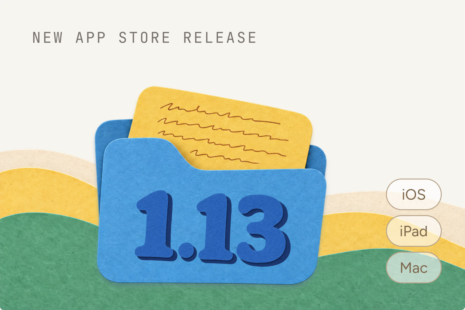
So in release 1.13 we rebuilt the quick create menu from scratch. Every option now has its own paper illustration, a stack of link cards, a folder, a sticky note and a speech bubble, big enough to recognise from the corner of your eye. On iPhone and iPad the menu grows right out of the plus button, and you pick what you want without reading a word.
On the Mac and in the web app it drops down from the plus in the sidebar, and every option shows its keyboard shortcut right on it. Glance at it a few times and you won't need to open it at all. And as you've probably noticed, the Mac and web apps now look the same too. Bringing them together is part of this release.
It's a small thing you touch many times a day, which is exactly why it was worth getting right.

Ready to unlock hidden potential on every page?
Start capturing your knowledge today. No credit card required, no complex setup - just sign up and start saving what matters.