Release 1.13

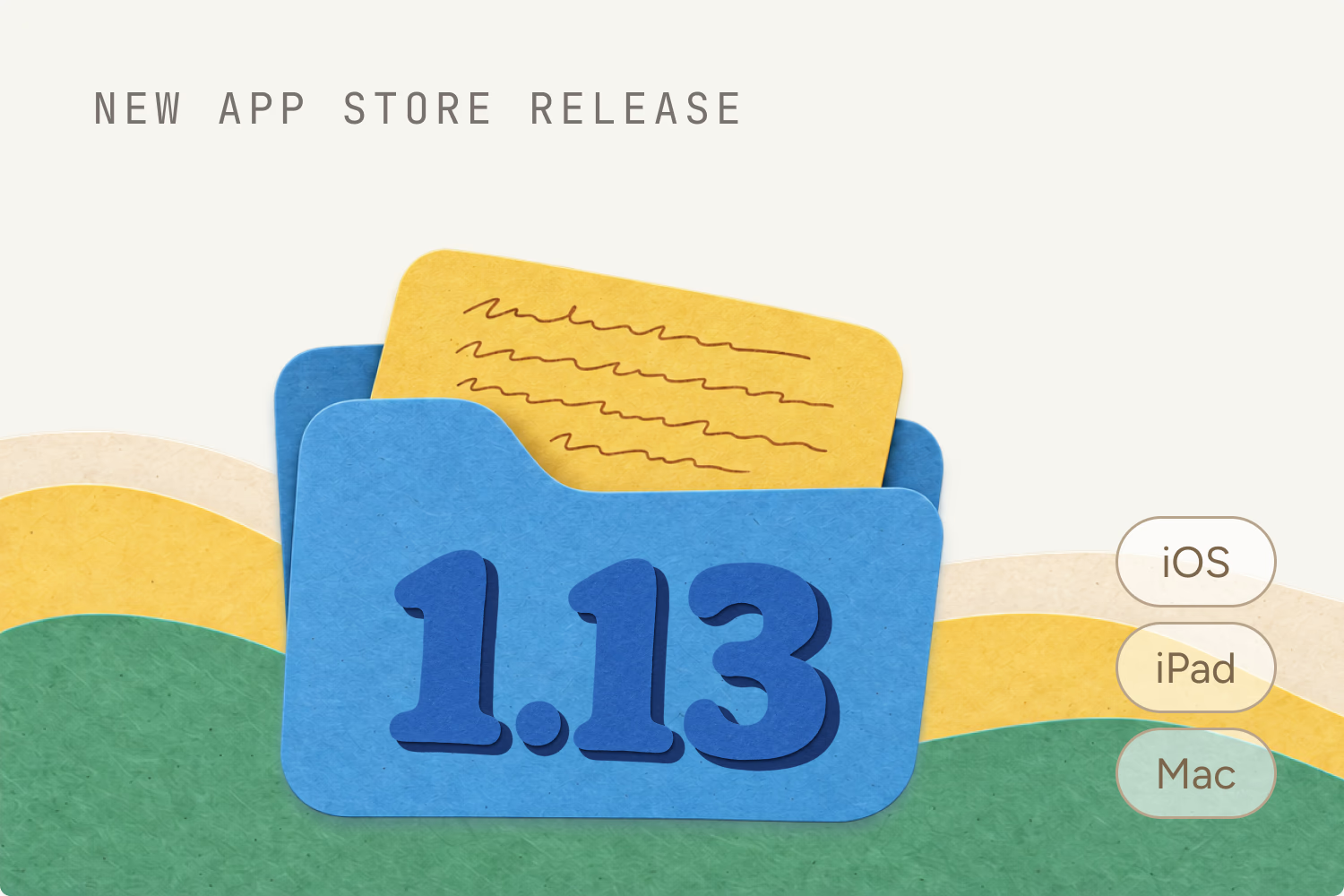
Release 1.13 is by far the biggest release Edicek has had so far. It's out now on iPhone, iPad and Mac, together with the web app, and it moves the app forward on many levels at once — how it looks, how it's organised and how it feels in your hands.
For the first time in Edicek's history, the native apps, the web app and the browser extension all look and feel the same. Whichever one you open, you're at home, and trust us, you'll feel it from the very first tap.
The biggest visual difference is the sidebar. It was completely reworked: your chats show up in a brand new style, and a switch at the top takes you between chats and cards in one tap. All of that made room for the biggest new feature of this release, collections. The trip, the recipes and the work stuff each get a place of their own, and every card you haven't sorted yet waits in the new Inbox. More on the redesign in a new look and a new sidebar.
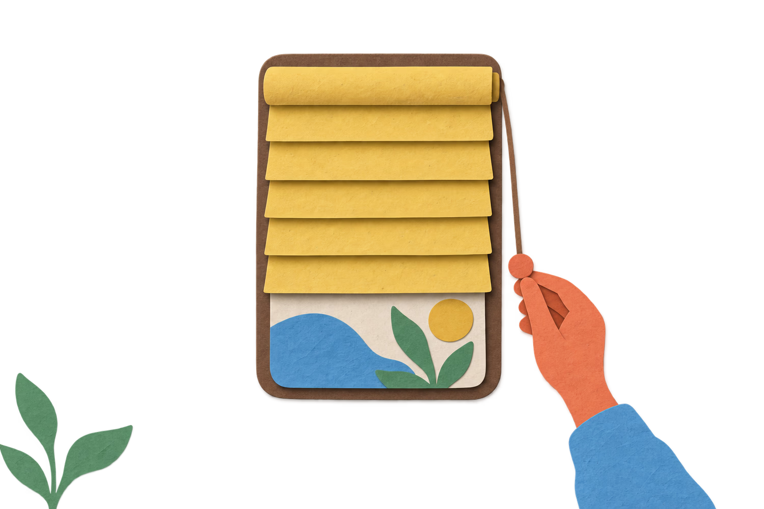
But most of this release is polish, and a lot of it. Things that have been in Edicek for a long time got another careful pass: the plus button now opens a quick create menu where every option has its own illustration, empty screens finally move, and sensitive cards hide behind a paper blind instead of a blur that slowed the app down. Dozens of smaller details were fixed along the way, the kind you don't notice until they're gone.
This is a grown-up Edicek, and we can't wait for you to try it.

Ready to unlock hidden potential on every page?
Start capturing your knowledge today. No credit card required, no complex setup - just sign up and start saving what matters.